Kyoto University of Art and Design Graduation Show & Graduate School Completion Show
Hearing from gallerists and collectors that “the Kyoto University of Art and Design graduation show is fascinating,” I decided to go and see it for myself.
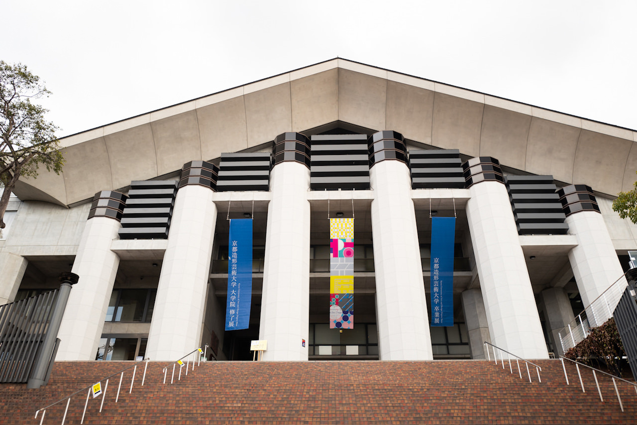
Kyoto University of Art and Design’s Uryuyama Campus can be reached by a single bus (route “5”) from Kyoto Station, which stops right at the school.
Kyoto University of Art and Design has been designed to make use of the sloping terrain of Uryuyama, so there are many stairs, and walking around the campus can be quite a challenge.
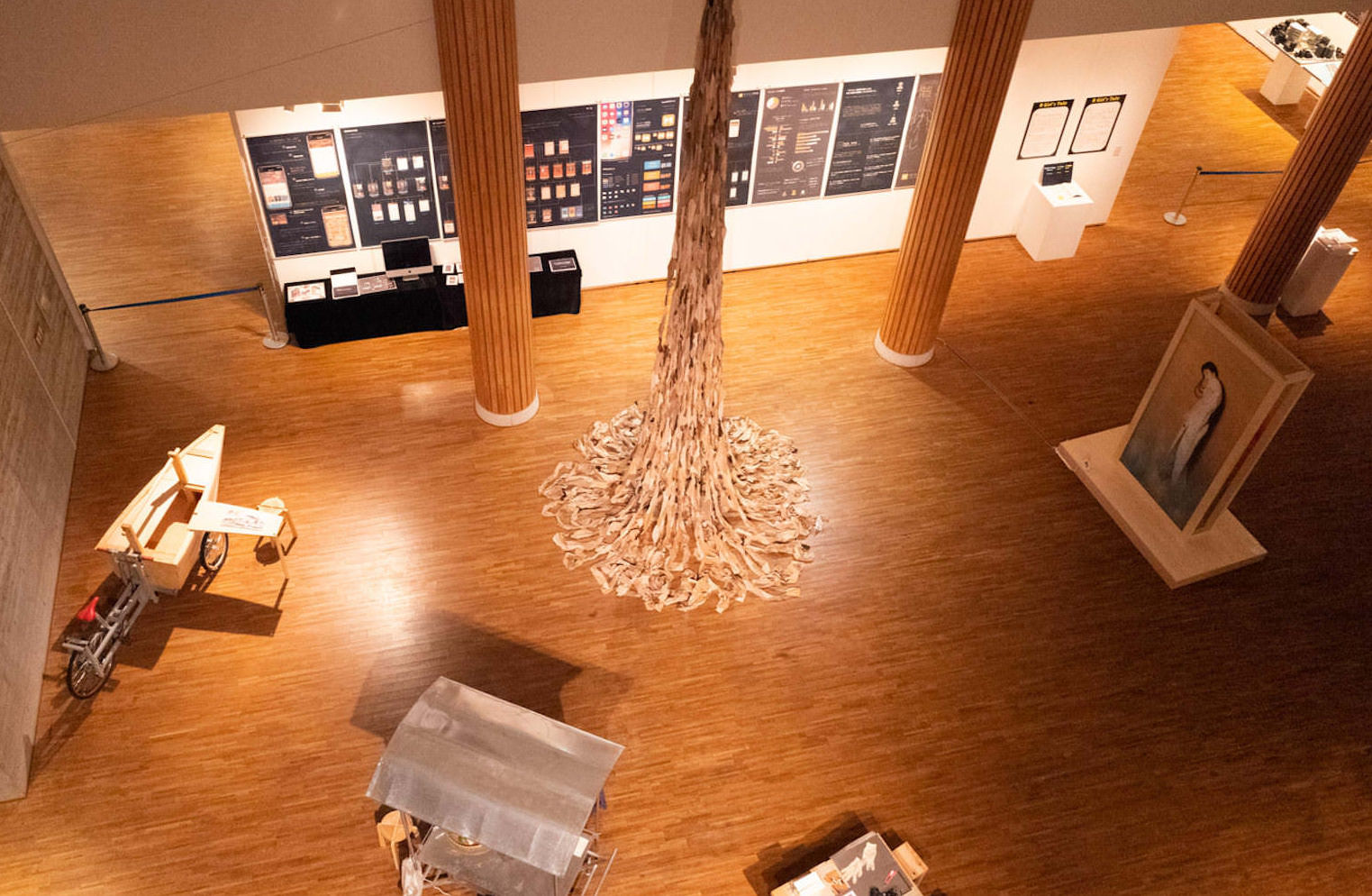
The first-floor “Galerie Aube” seen from an upper level
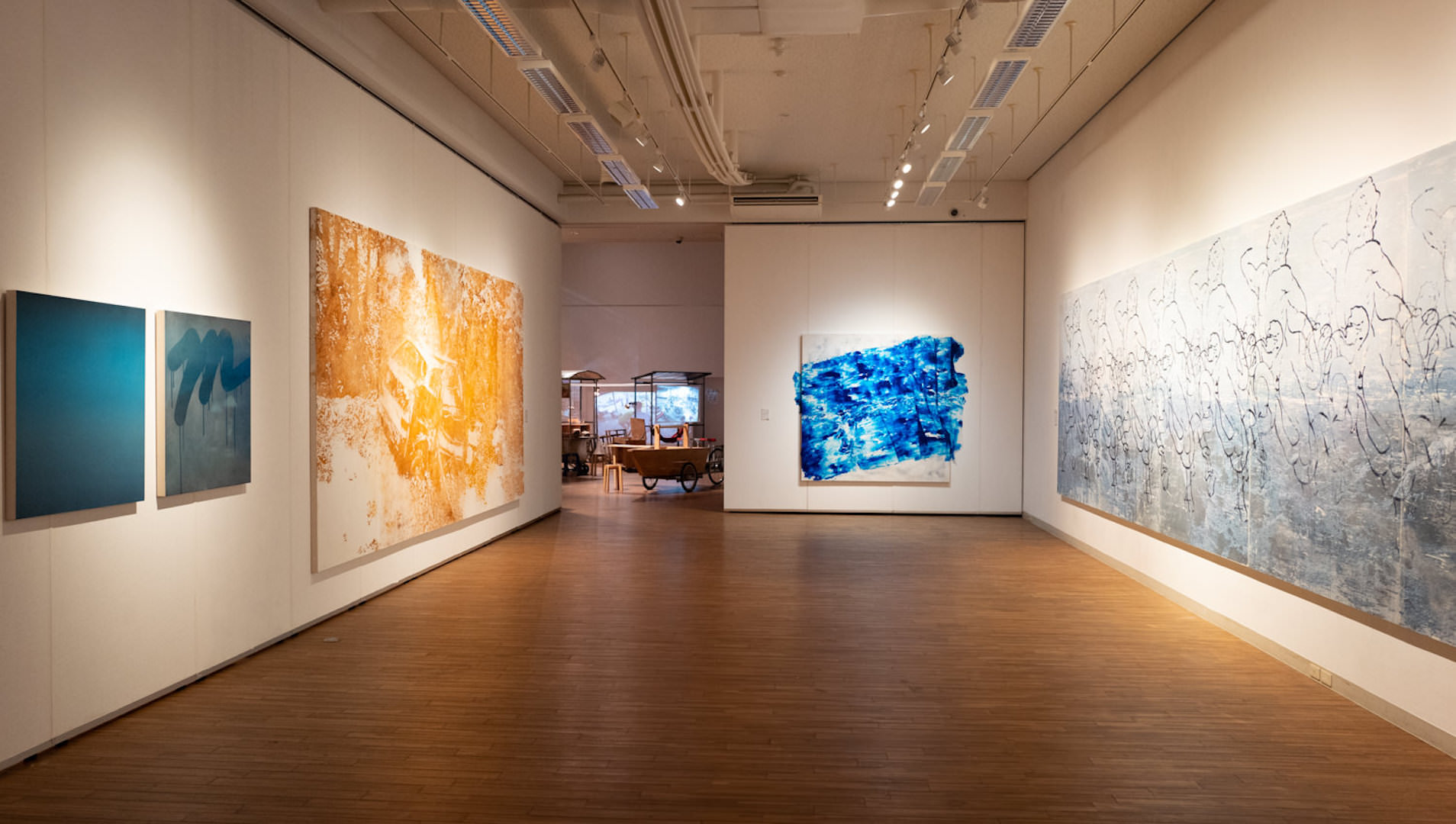
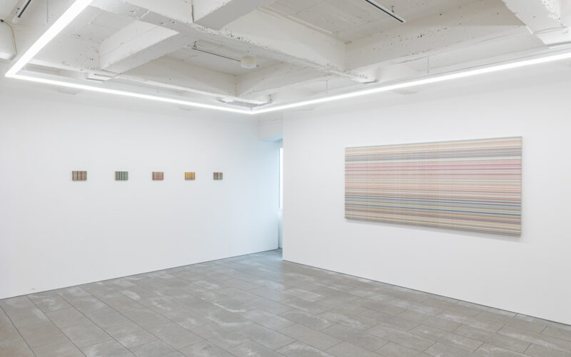
The exhibition space of “Galerie Aube” on the first floor is wide and has a high ceiling, allowing the works to stand out beautifully.
Installation view — Galerie Aube
An Exhibition Where You Can Buy the Works
Kyoto University of Art and Design seems to place strong emphasis on nurturing students into independent artists as they leave school.
One of the reasons the author decided to visit this time was that the school has established a rule allowing the graduation and completion works to be purchased, just like at an art fair.
By actually selling their works, the students are given the chance to experience firsthand a variety of promotional and communication activities, such as explaining their works to viewers and setting prices.
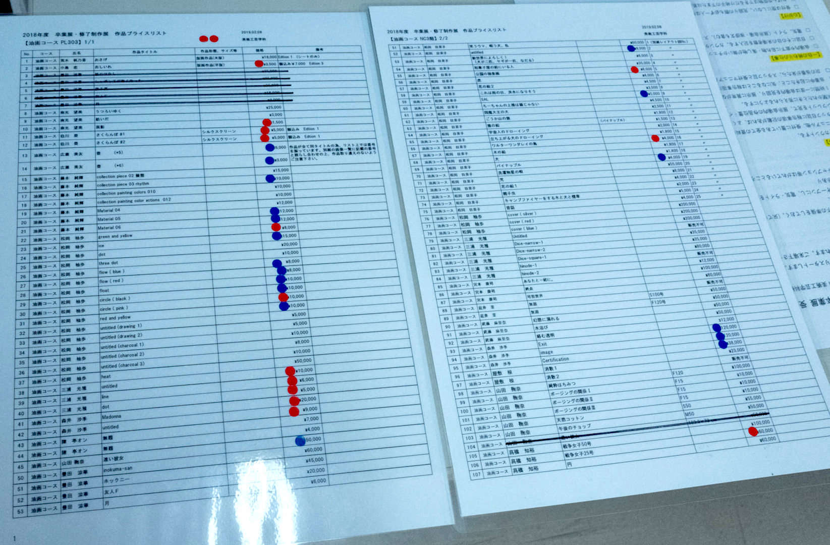
Both the red and blue dot stickers indicate that a work has been sold; they simply distinguish the buyer’s category. Blue dots mark works sold to industry insiders, red dots mark works sold to the general public.
The prices set by the students are quite reasonable. The students themselves also handle communication with their buyers.
Everything through to the final handover of the work is carried out as part of their education.
Students Who Caught My Attention
Below, I introduce some of the students whose works I found particularly interesting.
Fukumi Nakazawa
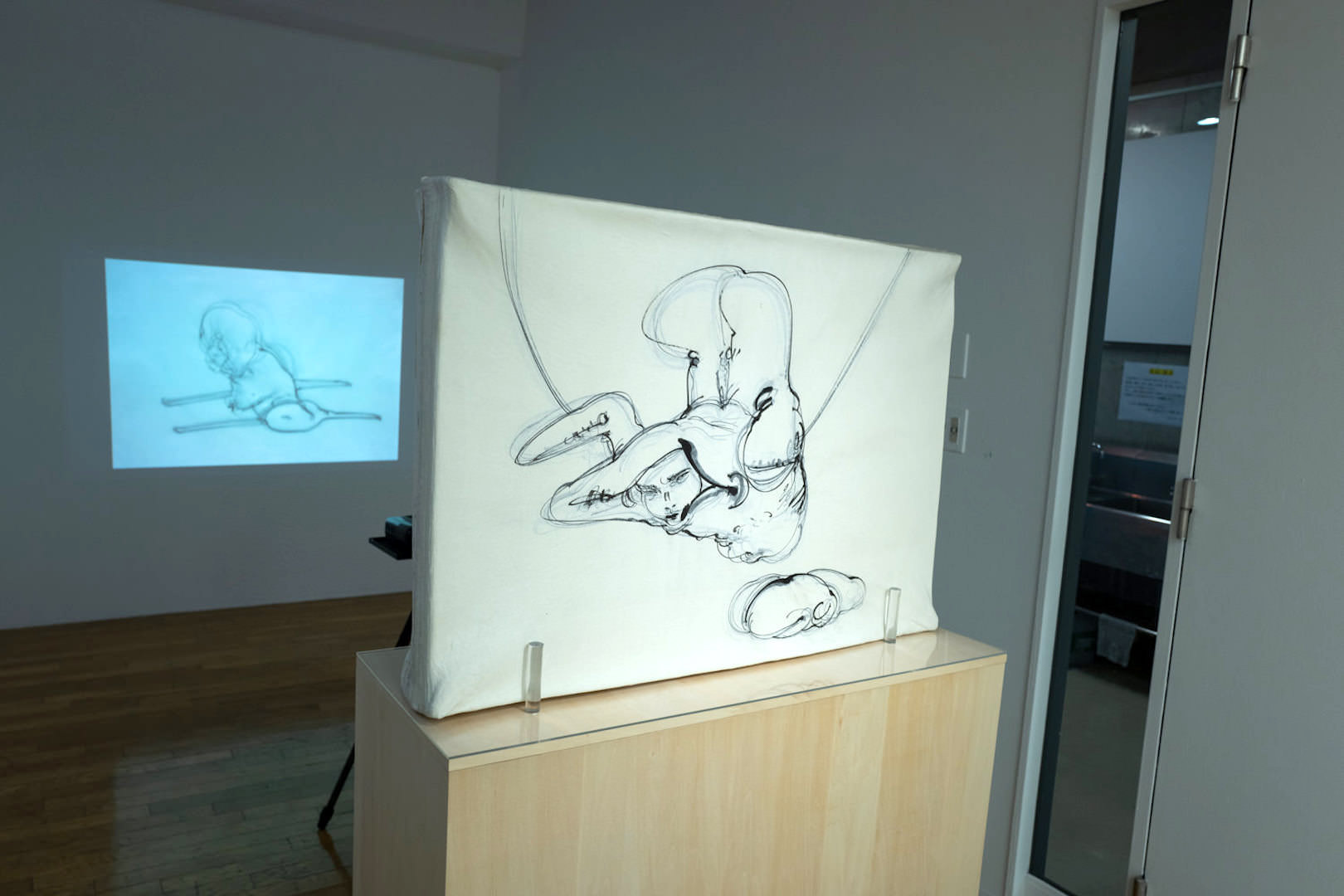
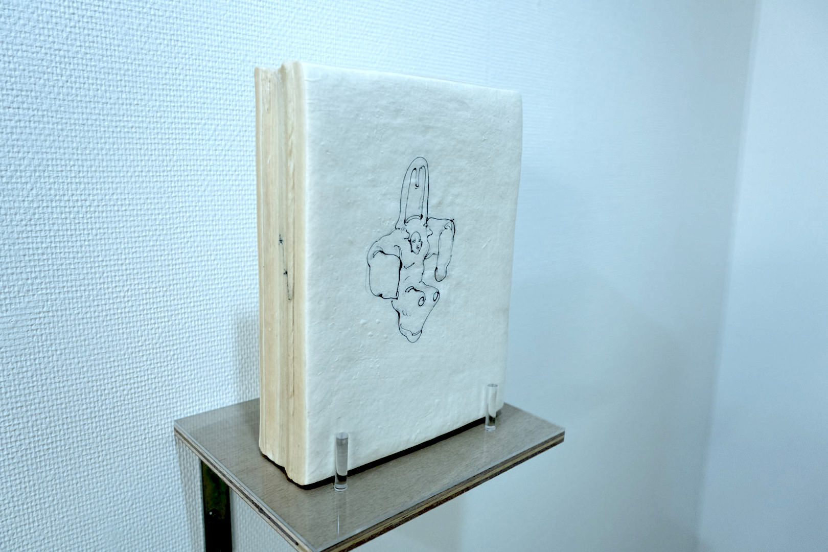
Fukumi Nakazawa’s works are made by drawing on individual sheets of Japanese paper (washi), turning them into an animation, and then gluing all the sheets together into a single piece.
Fukumi Nakazawa, “A Certain Town — Town A”
The stacked sheets of washi are translucent, so the lines from the drawings behind faintly appear through, layering like afterimages.
The thickness of the stacked washi corresponds to the length of the animation
Yuki Murai
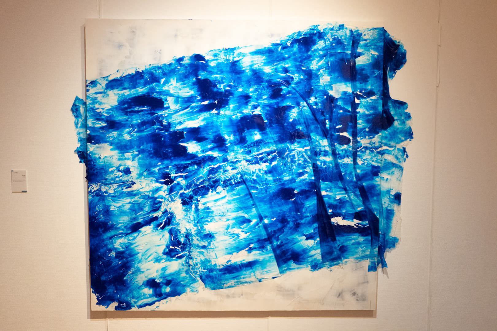
Yuki Murai is an artist deeply committed to the color blue — specifically a shade called “Phthalo Blue.”
Yuki Murai, “Restraint of the Id”
She primes the canvas and then naturally pours paint onto a material called Kutzkarne to create blue patterns.
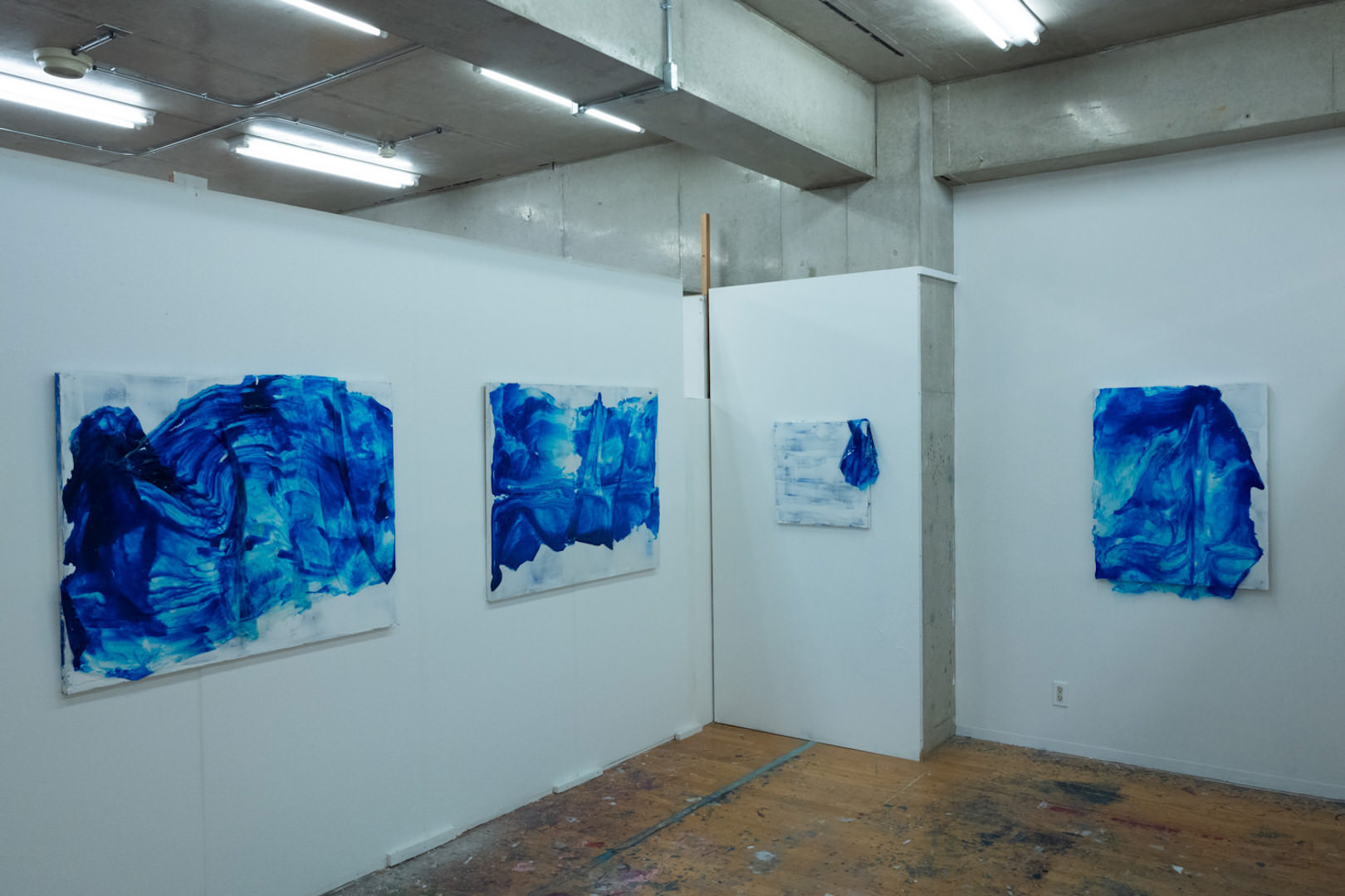
Installation view from her studio
The texture of the primed canvas surface is intriguing, and she has succeeded in a treatment that makes the beautiful blue shine even more vividly.
Shohei Yamamoto
Shohei Yamamoto focuses on materials in his work.
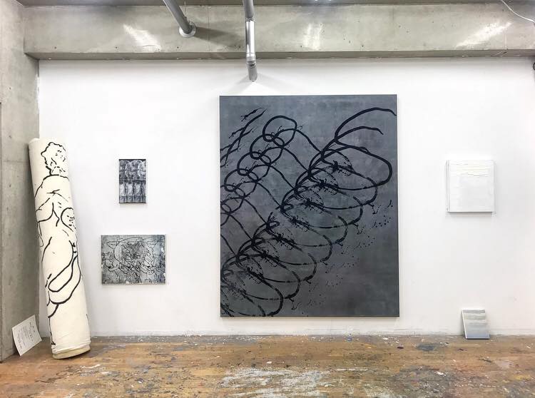
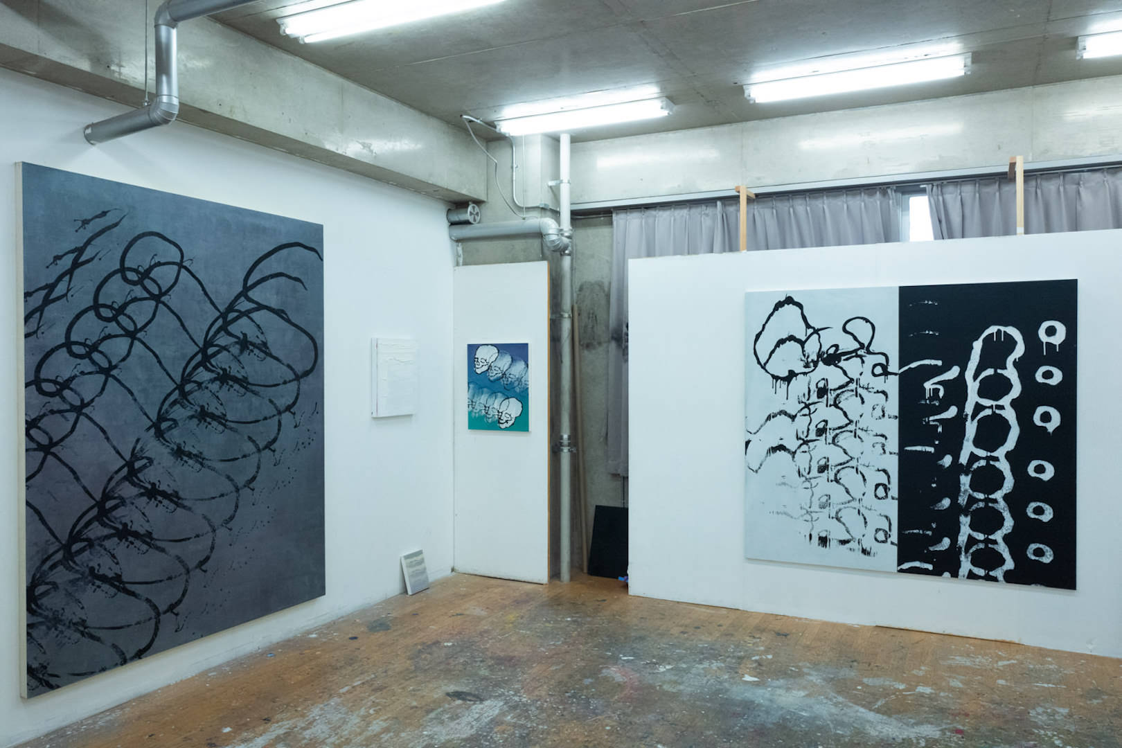
He uses hand-made rollers to imprint repeating patterns onto the canvas.
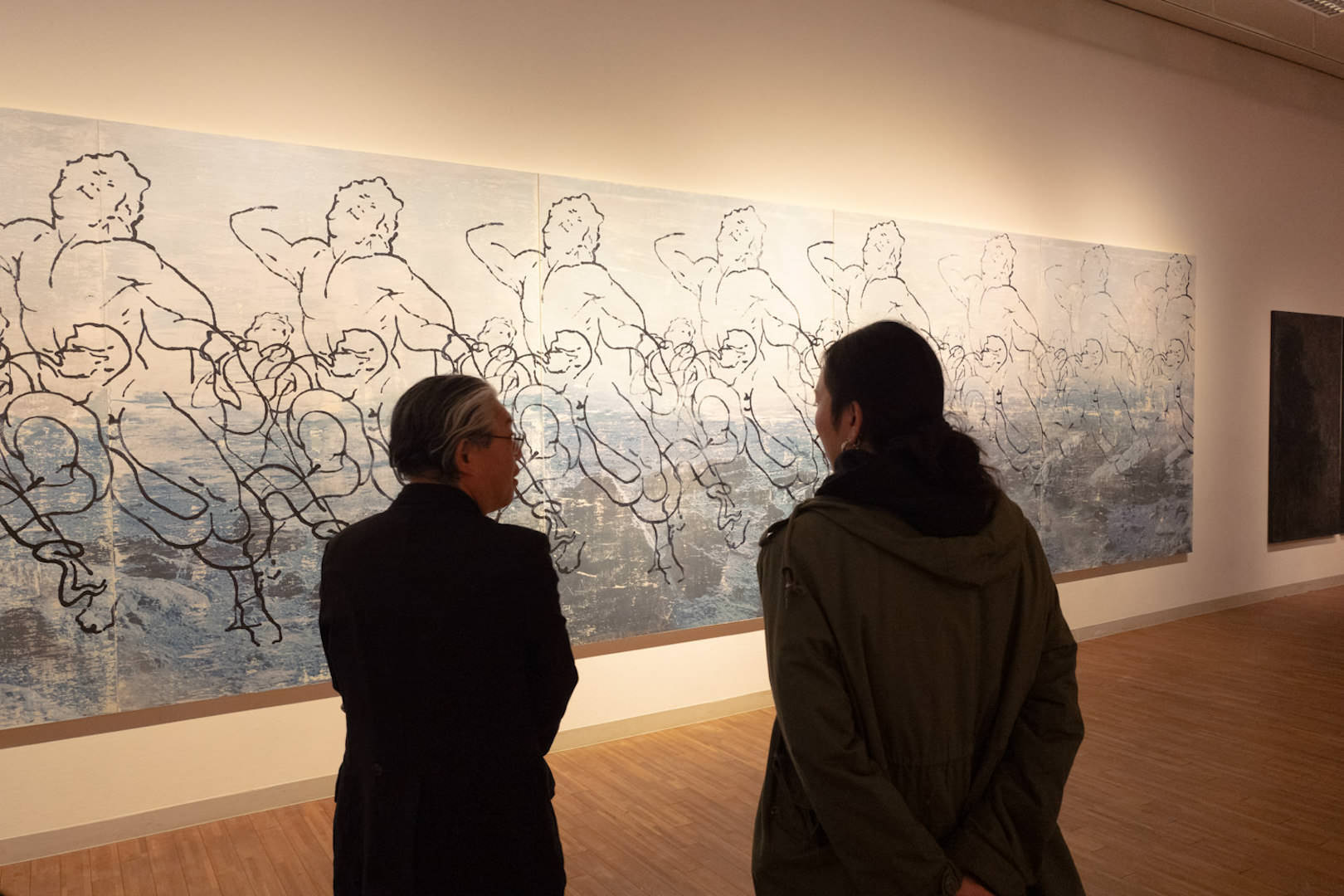
Shohei Yamamoto, “Reiterate -Laocoonte-” — during a critique by Mr. Miyazu
The complex abstract works, drawn with rollers, are engraved with geometric patterns.
The object leaning on the left in the photo is the “roller”
I especially liked how, when he leans toward the figurative — as in his skeleton pieces — the afterimage-like quality becomes even more pronounced.
Installation view from his studio
Saki Morii
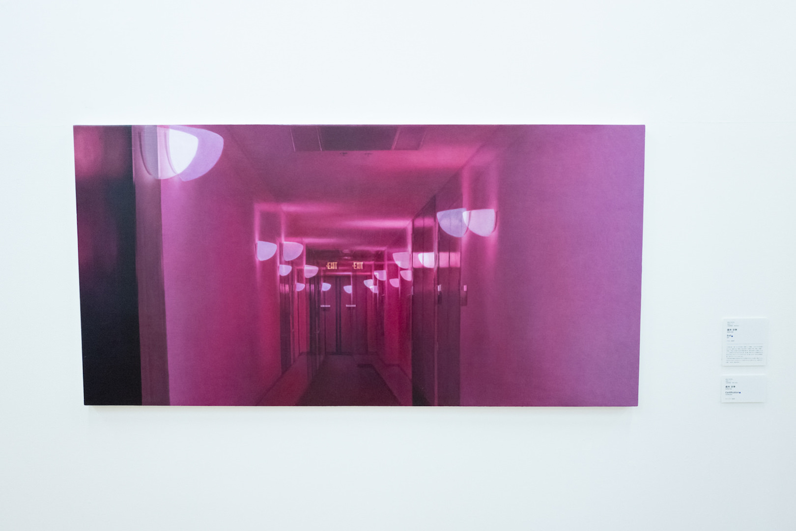
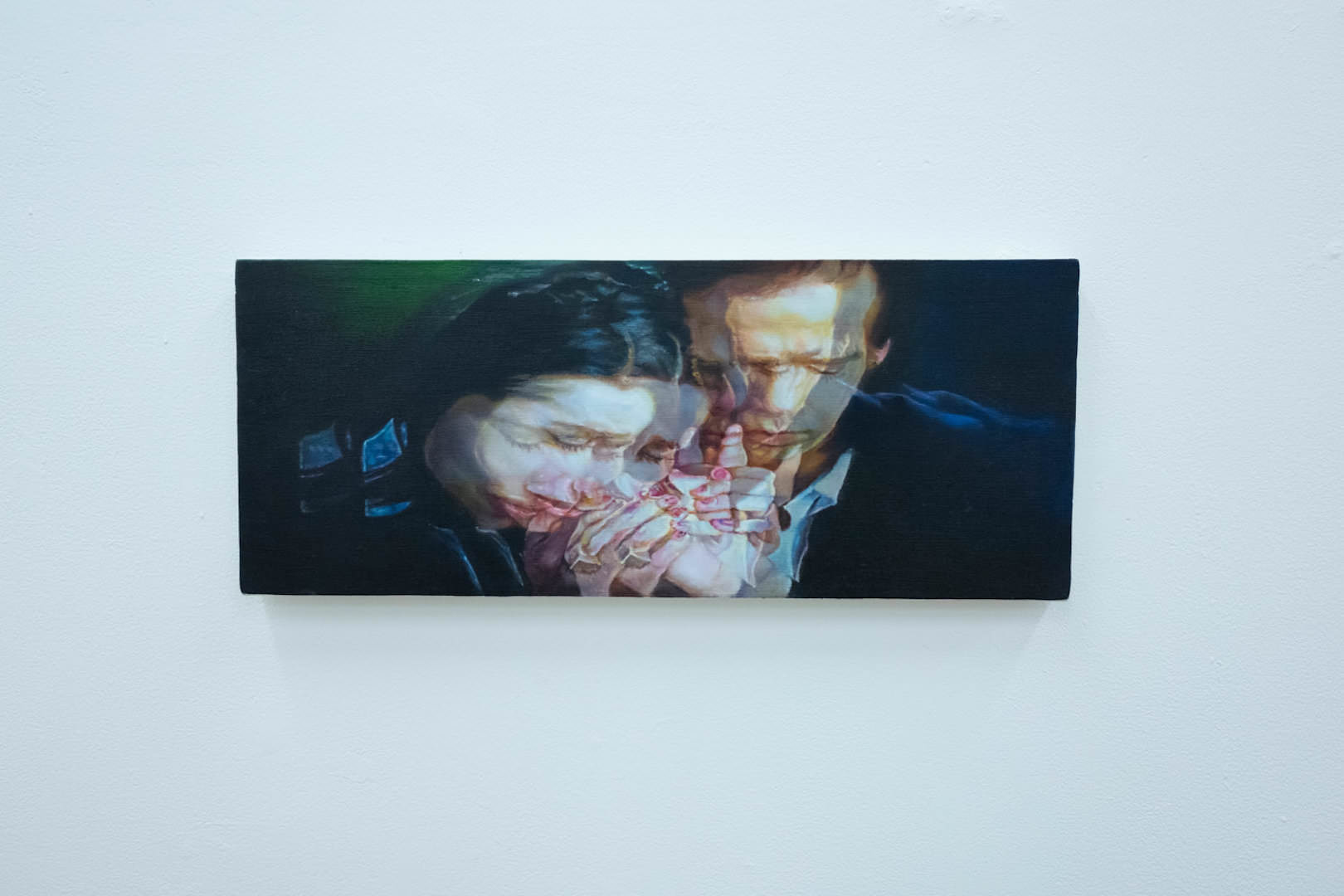
Saki Morii is a painter who brings opposing pairs of elements — light and shadow, front and back — onto her canvases.
The viewer’s gaze is drawn back and forth, and the works hold you spellbound.
Saki Morii, “Exit”Saki Morii, “Certification”
Ryoko Ishikawa
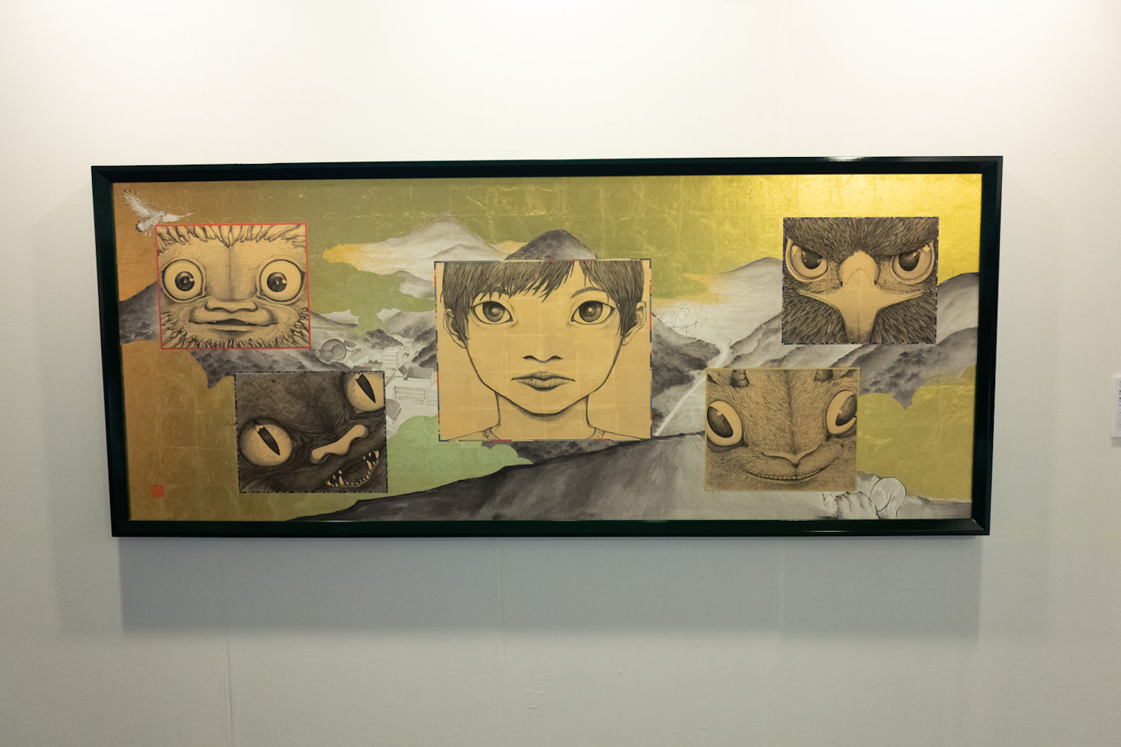
The Japanese-painting students delighted us with a broad range of works.
Ryoko Ishikawa is an artist whose works cast a gentle gaze toward living creatures.
Ryoko Ishikawa, “Each One.”
Rema Narita
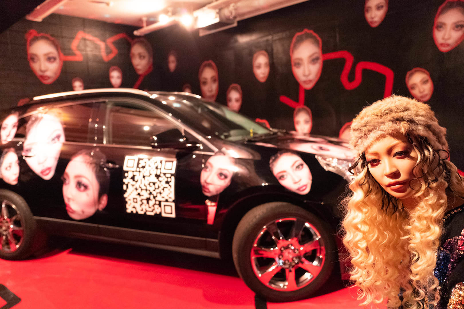
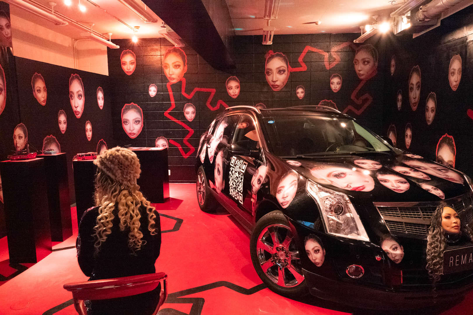
The one who most vividly projected a unique worldview was Rema Narita (REMA), a student in the Integrated Fine Arts department.
His exhibition space was packed with obsessive detail — self-portrait works developed into a variety of forms, including footage of him driving a decorated car through the city and a mannequin cast of himself.
A mannequin work that looks exactly like the artistInstallation view
There were many more students I would have liked to introduce, but from every one of them I felt a strong energy — the drive to pursue a serious career as an artist.
I have written separate articles about Shinya Azuma and Kurumi Kotani, so please see those as well.
Sales of the students’ works appeared to be going very well.
Prices were friendly, of course, but what left the strongest impression was seeing the students engaging viewers face-to-face, carefully explaining their ideas as artists and describing their works.
When I spoke with a Japanese-painting student, I heard some fascinating things about the university’s educational program.
What struck me was that this is not a top-down, imposed curriculum, but rather one that encourages the students’ independence.
Lastly, I want to note how warmly the students hosted visitors — a very positive impression indeed.
This was a graduation and completion show that I would happily attend again.
Kyoto University of Art and Design 毕业展・研究生院修了展
从画廊主和藏家圈子里听说”Kyoto University of Art and Design 的毕业展很有意思”,于是笔者前往参观。
Kyoto University of Art and Design 瓜生山校区从京都站乘坐”5路”公交车一趟即可抵达,下车即到校门口。
Kyoto University of Art and Design 的设计充分利用了瓜生山的坡地,因此楼梯很多,巡视整个校园相当费力。
从上层俯瞰1楼的”Galerie Aube”
1楼”Galerie Aube”的展览空间既宽敞又高挑,作品陈列其间格外抢眼。
展览现场——Galerie Aube
可以购买作品的展览
Kyoto University of Art and Design 的艺术教育似乎非常注重让即将踏出校门的学生们作为艺术家实现自立。
笔者此次前往的原因之一,就是这里设立了像艺术博览会一样可以购买毕业展・修了展作品的规则。
据说其目的是通过实际的作品销售,让学生亲身体验向观众进行说明、定价等各种推广与沟通活动。
갤러리스트와 컬렉터 사이에서 “Kyoto University of Art and Design 의 졸업전이 재미있다”는 이야기를 듣고 다녀왔다.
Kyoto University of Art and Design 우류산 캠퍼스는 교토역에서 “5번” 버스 한 대만 타면 학교 바로 앞 정류장에 도착한다.
Kyoto University of Art and Design 은 우류산의 경사면을 살린 설계 탓에 계단이 많아, 캠퍼스를 한 바퀴 돌아보는 데도 상당한 수고가 든다.
위층에서 내려다본 1층 “Galerie Aube”
1층 “Galerie Aube”의 전시 공간은 넓고 천장도 높아, 작품이 한층 돋보인다.
전시 전경 — Galerie Aube
작품을 구입할 수 있는 전시
Kyoto University of Art and Design 의 예술 교육은 학교를 떠나 세상에 나가는 학생들이 아티스트로서 자립할 수 있도록 강하게 의식하고 있는 듯하다.
필자가 이번에 발걸음을 옮긴 이유 중 하나는, 아트페어처럼 졸업전・수료전 작품을 구입할 수 있는 규칙을 마련해 두었다는 점이었다.
실제로 작품을 판매함으로써 관람객에게 설명하고 가격을 매기는 등, 다양한 홍보와 커뮤니케이션을 몸소 경험하도록 하는 것이 그 취지라고 한다.
빨간 동그라미 스티커도 파란 동그라미 스티커도 모두 판매 완료를 뜻하며, 구매자의 구분을 나타낸다. 파란 스티커는 업계 관계자, 빨간 스티커는 일반 관람객이다.
학생들이 매긴 가격은 상당히 합리적이다. 구매자와의 연락도 학생들이 직접 담당한다.
작품 인도의 마지막 단계까지, 어디까지나 교육의 일환으로 이루어지고 있다.
인상 깊었던 학생들
이하, 전시작 중에서 인상 깊었던 학생들을 소개한다.
Fukumi Nakazawa
Fukumi Nakazawa 의 작품은 한 장 한 장 와시(일본 종이)에 그린 그림을 애니메이션화한 뒤, 모든 와시를 풀로 굳혀 하나의 작품으로 완성하는 기법이다.
Fukumi Nakazawa 《어느 마을 A마을》
겹쳐진 와시의 그림이 서로 비쳐, 뒤쪽 그림의 선이 어렴풋이 떠오르며 잔상처럼 포개진다.
겹쳐진 와시의 두께는 애니메이션 길이에 비례한다
Yuki Murai
파란색에 집착하는 Yuki Murai 는 특히 “Phthalo Blue”라는 색상에 강한 애착을 지닌 작가다.
Yuki Murai 《이드의 억제》
캔버스에 밑칠을 한 뒤, Kutzkarne 라는 소재에 물감을 자연스럽게 흘려 넣어 파란 무늬를 만들어내는 기법이다.
아틀리에에서의 전시 전경
밑칠을 한 캔버스 표면의 질감이 흥미로우며, 맑은 파랑이 한층 더 빛나는 처리에 성공한 듯 보인다.
Shohei Yamamoto
소재에 주목해 작품을 제작하는 이는 Shohei Yamamoto 다.
직접 만든 롤러로 캔버스에 반복되는 문양을 새겨 넣는 방식이다.
Shohei Yamamoto 《Reiterate -Laocoonte-》 — Miyazu 씨의 강평 중
롤러로 그려낸 형상은 복잡한 추상 작품으로, 기하학적 문양이 새겨져 있다.
사진 왼쪽에 세워져 있는 것이 “롤러”이다
해골 작품처럼 구상 쪽으로 기울면, 잔상의 이미지가 한층 짙어져 개인적으로 마음에 들었다.
아틀리에에서의 전시 전경
Saki Morii
Saki Morii 의 작품은 빛과 그림자, 앞과 뒤 등 상반된 두 요소를 캔버스 위에 담아내는 페인터다.
관람자의 시선은 흔들리며, 작품에서 눈을 뗄 수 없게 된다.
Saki Morii 《Exit》Saki Morii 《Certification》
Ryoko Ishikawa
일본화 전공 학생들은 폭넓은 작품들로 즐거움을 안겨 주었다.
Ryoko Ishikawa 는 생명에게 향하는 따뜻한 시선을 작품에 담아내는 작가다.
Ryoko Ishikawa 《저마다.》
Rema Narita
독자적인 세계관을 강렬하게 발신하고 있던 것은 종합조형 전공의 Rema Narita(REMA)였다.
장식한 자동차를 실제로 거리에서 주행한 영상, 자신의 마네킹 등 셀프 포트레이트 작품을 다양한 형태로 확장한, 집념이 응축된 전시 공간이었다.
본인과 꼭 닮은 마네킹 작품전시 전경
이 외에도 소개하고 싶은 학생이 많았지만, 모두에게서 본격적인 작가 활동을 이어가려는 강한 에너지가 느껴졌다.
Shinya Azuma 와 Kurumi Kotani 에 대해서는 별도의 기사로 정리해 두었으니 함께 참고하시길 바란다.
학생들의 작품 판매는 매우 순조로워 보였다.
가격 설정이 부담 없는 점도 있었지만, 관람자를 마주하고 작가로서의 생각과 작품에 대한 설명을 진지하게 나누는 광경이 인상적이었다.
일본화 학과의 한 학생과 이야기를 나누었을 때, 대학 교육 프로그램에 대한 흥미로운 이야기를 들을 수 있었다.
필자가 느낀 것은 강요형 교육 프로그램이 아니라 학생의 자립을 촉진하는 프로그램이었다는 점이다.
끝으로, 학생들이 호스트 역할로서 따뜻하게 응대해 준 점이 무척이나 호감을 남겼음을 기록해 둔다.
다시 한 번 찾고 싶어지는 졸업전・수료전이었다.