On January 6, 2020, the official art posters for the Tokyo 2020 Olympics were unveiled.
For the Tokyo 2020 Games, artworks themed on the Olympics and Paralympics were commissioned from artists in Japan and abroad, and are used as Tokyo 2020 official art posters to help build momentum.
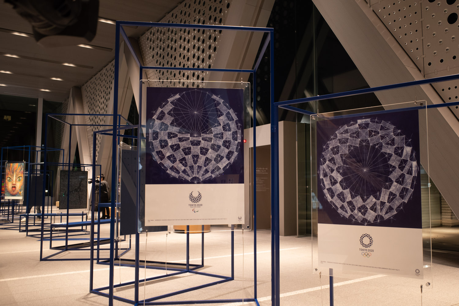
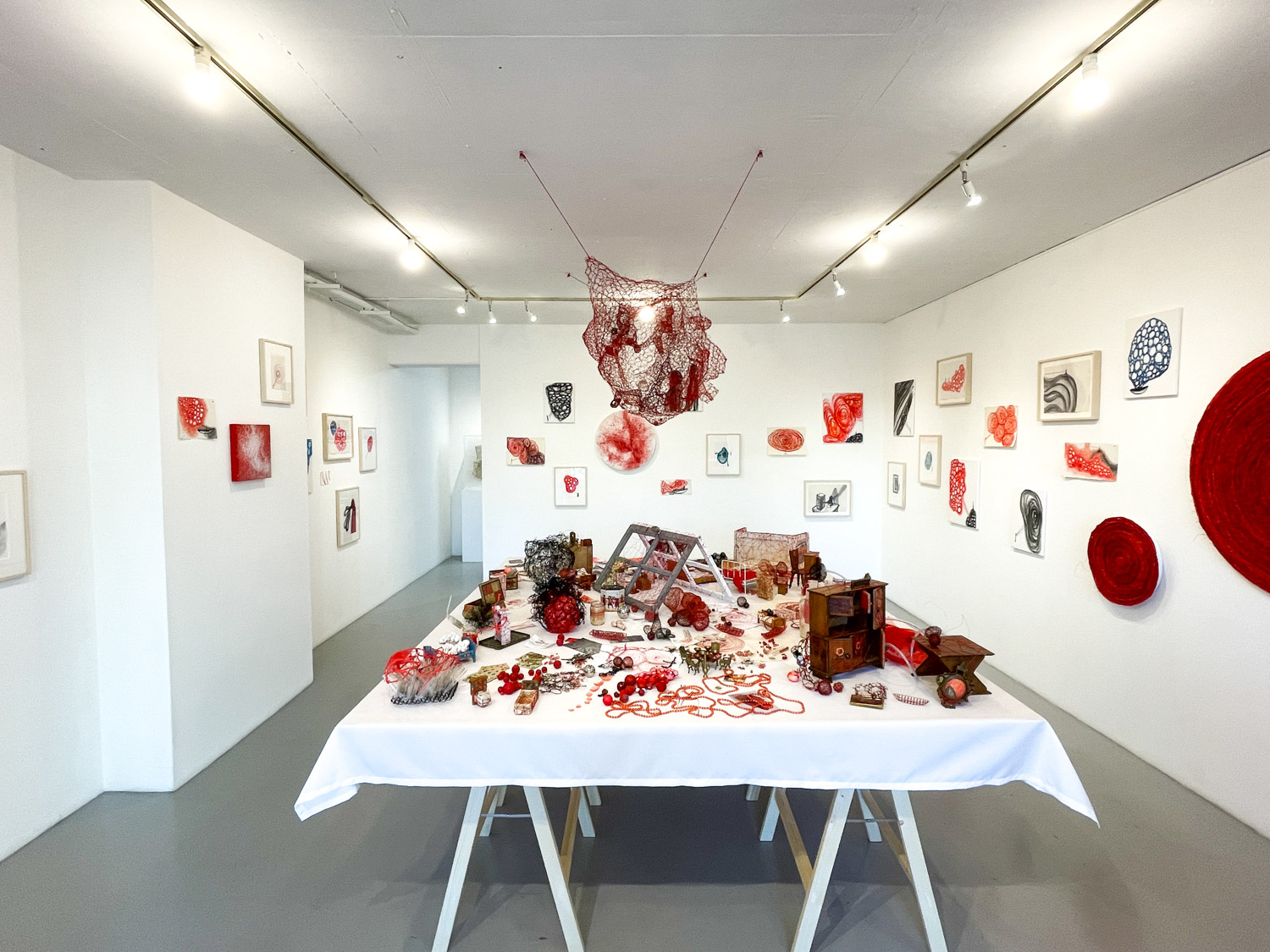
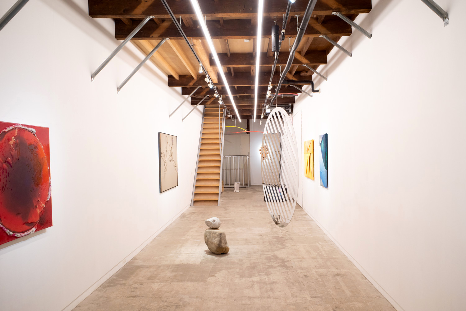
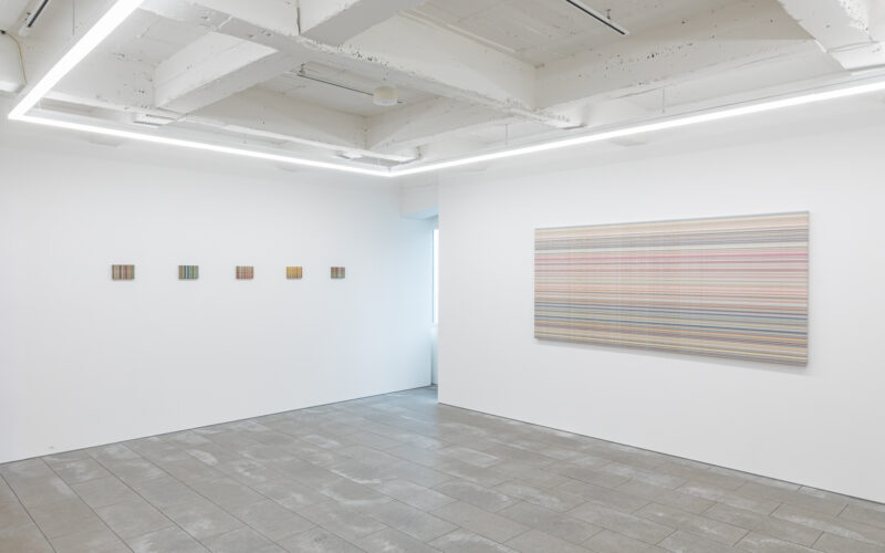
“Tokyo 2020 Official Art Poster Exhibition,” installation view @ Museum of Contemporary Art Tokyo
Since the early 20th century, each Games’ organizing committee has produced posters to promote awareness and understanding of the Olympics as a sporting and cultural event. Olympic posters also serve to convey the character of each Games to the world.
In recent years, including Paralympic posters, internationally active artists and designers have been commissioned to create works that become each Games’ cultural and artistic legacy. Among them, works that become icons of their era have also been born.
Below, we present all 20 works produced.
12 Olympic Works
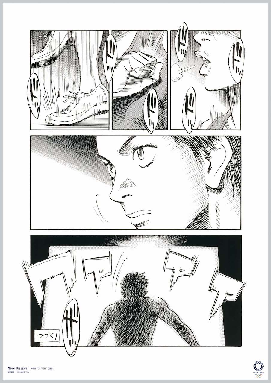
Naoki Urasawa (manga artist)
Japan has a genre of manga rarely seen elsewhere in the world: sports manga. This played a major role in the development and flourishing of Japanese manga, because the excitement of watching sports fit the publication pace of Japan’s weekly manga. Manga artists have continually challenged themselves to convey the thrilling excitement of sports through manga.
“To be continued in the next issue!” Every week, readers watch over the next development as if it were the outcome of a real competition.
This is a manga drawn especially for the Olympics. I tried a way of drawing that transcends sport, race, and gender. Everyone has their turn. Next, it’s your turn.
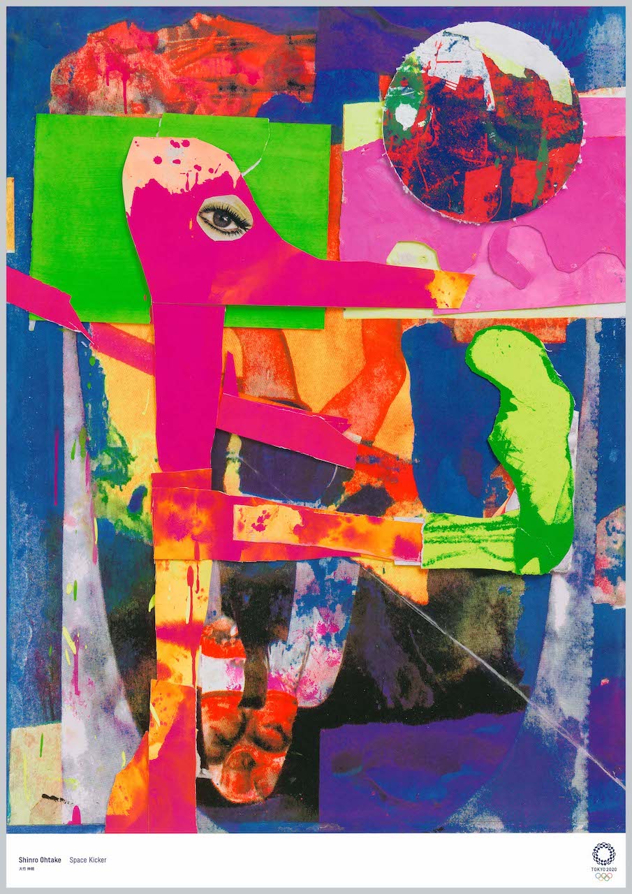
A group of colorful celestial balls flitting through outer space at the speed of light… a once-in-a-lifetime play between glittering, brilliant colors and the gods… far above the ground, I was daydreaming such an Olympic scene.
Abruptly, a pink figure appeared.
Without blinking, without tiring, it calmly kept kicking up a bright red sphere.
Was it the “god of play”?
I remembered learning “paper cutting (kiri-e)” at the elementary school I attended during the 1964 Tokyo Olympics. I thought I’d try to express the imaginary cosmos in my head through paper cutting.
I randomly cut out colored paper, printed matter, and half-finished paintings scattered around my studio and threw them into the air… where the fluttering fragments of color fell, “Space Kicker” roughly emerged.
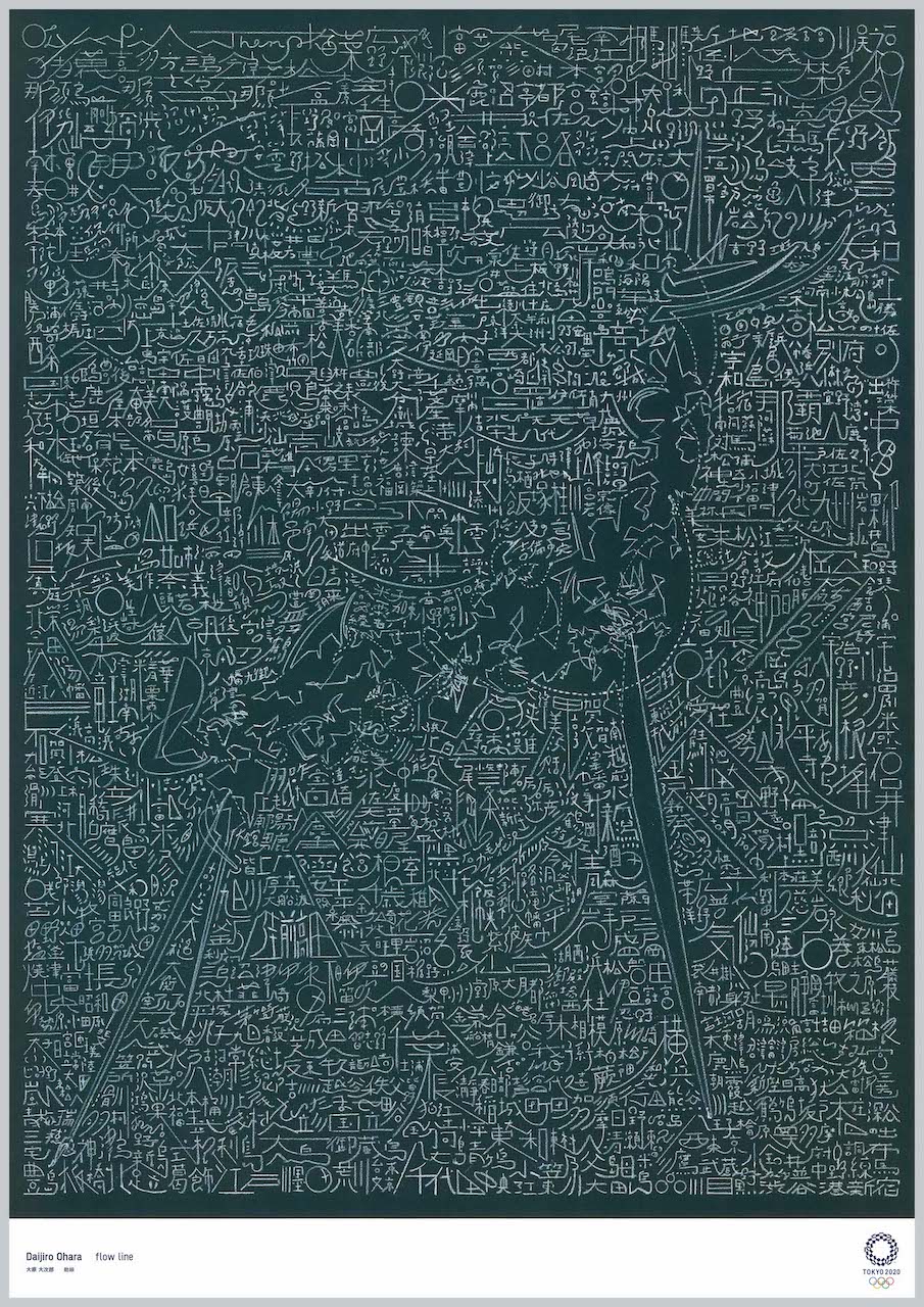
Lines of sight, parabolas, boundary lines, foreshadowing…. In this world, various lines intersect. Those countless lines, sometimes entangling and sometimes unraveling, form images within our environment and our body and mind.
In this work, starting from the sacred flame inherited from Greece, I depict the flow lines woven through the Tokyo 2020 Olympic torch relay, and the more than 800 municipality names that become their knots.
What on earth is the line connecting an individual to this festival where the world’s top athletes gather to compete? Connecting and breaking off—it is very difficult to draw in the line linking a great phenomenon and an individual. Even in such a diverse world where lines that won’t yield easily are tangled, I want to approach it with hope that there exist places where art and bodies that touch each person’s heartstrings well up.
With the wish that the souls of the athletes and the feelings of all the people who support the Games will soar high into the sky from here in Tokyo and reach people around the world.
The calligraphy, into which dazzling light streams, images the athletes’ dynamism. In the background I placed genuine gold leaf, an outstanding Japanese craft technique. To express the three-dimensionality of the calligraphy, everything down to the smallest detail, including the shading, is genuine; fusing the released energy with calligraphy and traditional technique into one, I express the Tokyo Olympics with “Japanese-ness.”
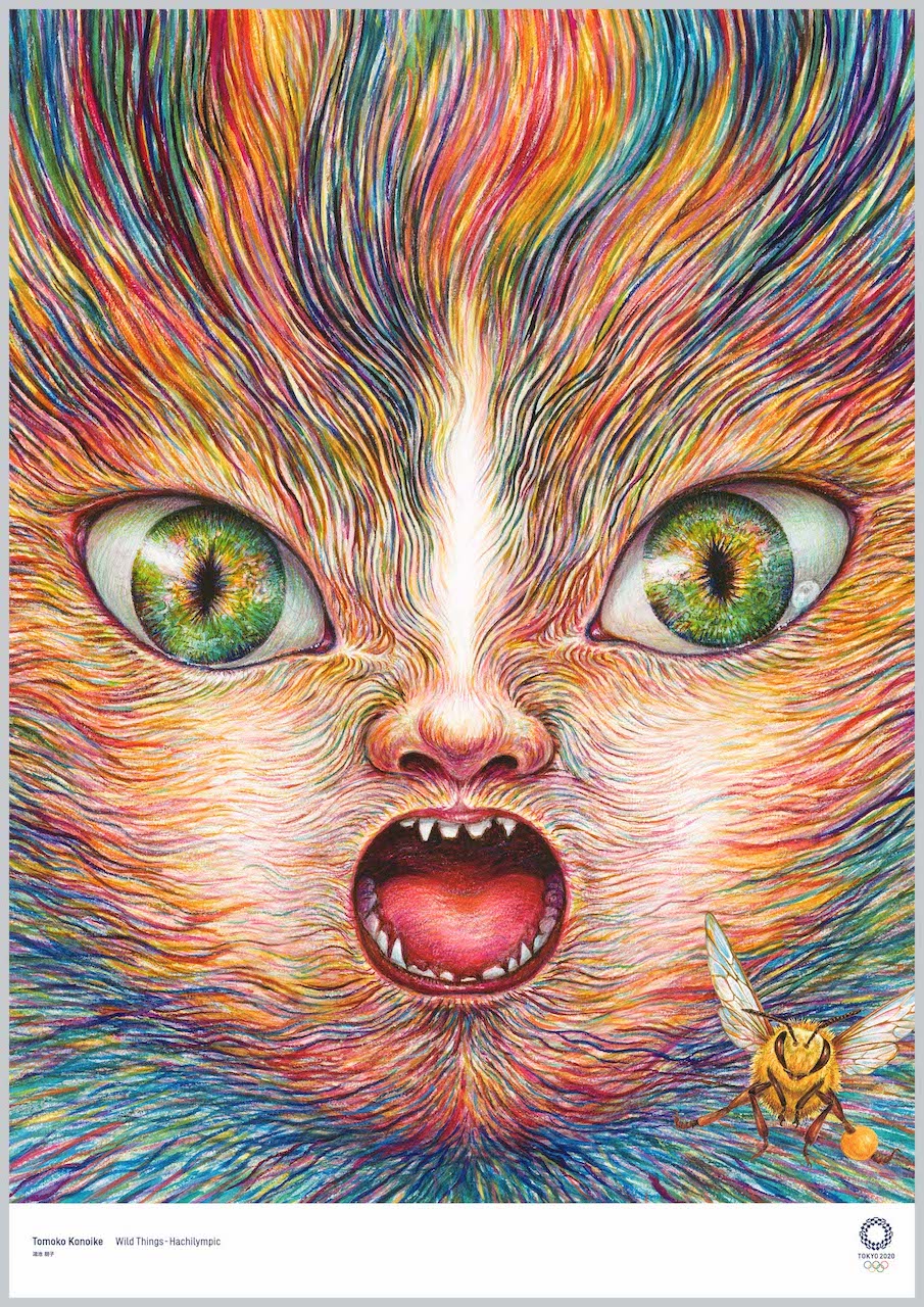
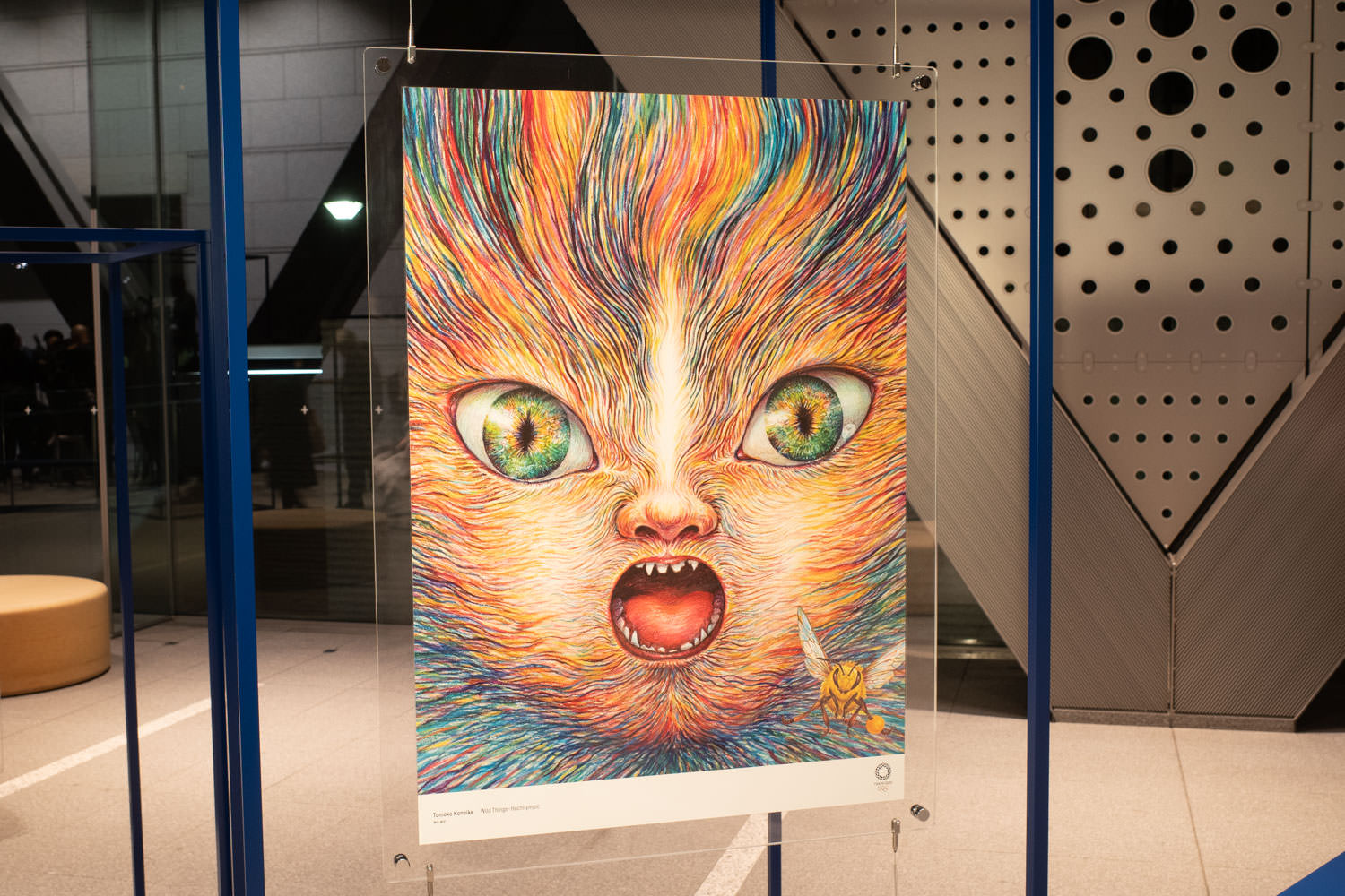
Each human being, as a single animal, has an entirely different body, grasps the world with entirely different senses, and lives the world through their own Umwelt. No two are the same. There are no same words. There is no same light. If the Olympics resolves itself to face that fact sincerely, then for one small creature the world becomes full of sensuousness, and eventually a new ecosystem begins to move.
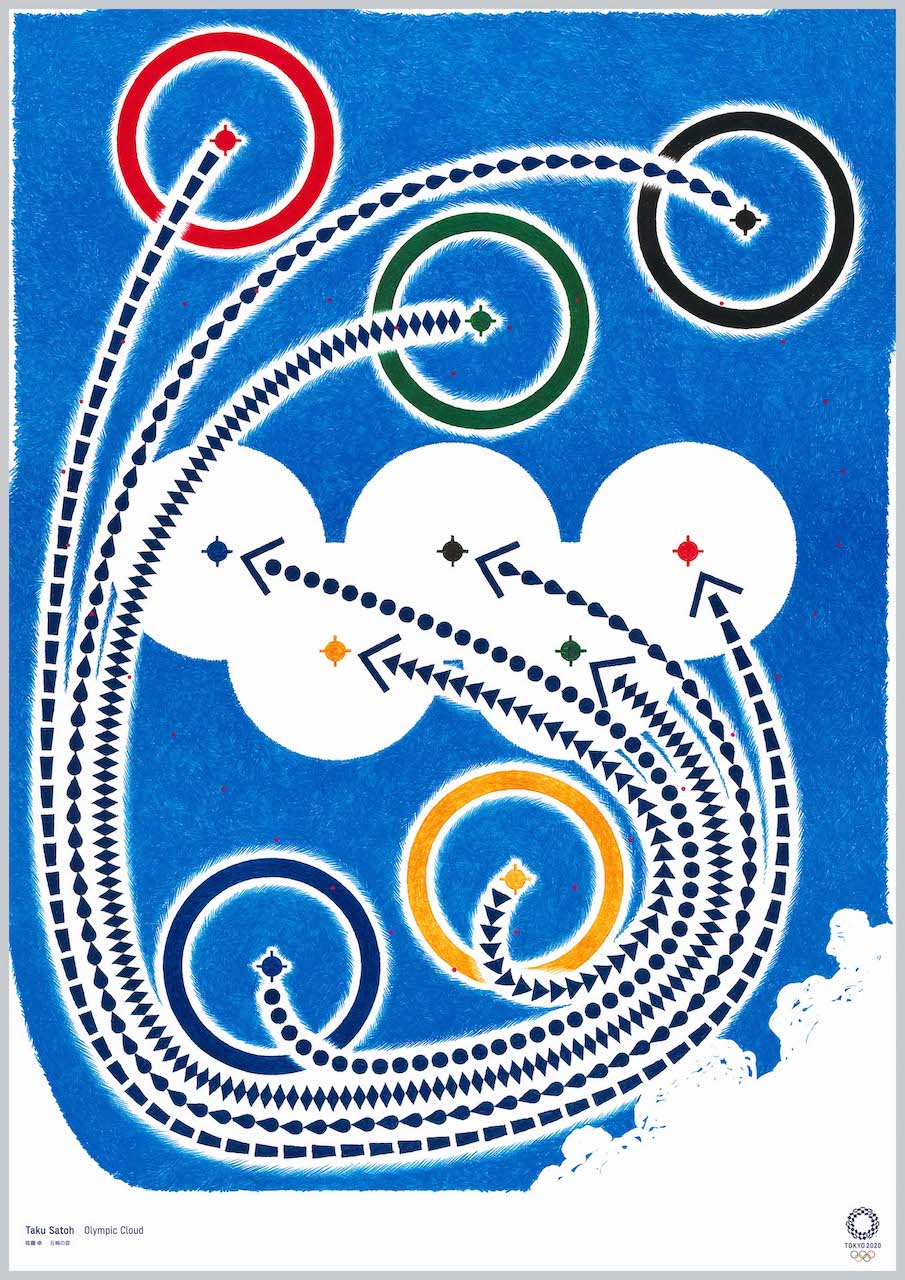
When five rings in separate places move along trajectories emanating from the center of each ring, they form the mark of the five rings. Here I expressed a “future” in which athletes gathering from around the world, each with their own individuality (diversity), compete (personal best), and their totality ultimately forms the harmonious figure of the five rings. In other words, the poster itself does not move like a video, but I created it imagining the dynamic image that arises in your mind when you see it.
I insisted on entirely hand-drawn expression because the Olympics is a competition that challenges the body’s limits. I also embedded a message here against the modern tendency to prioritize thinking with the brain and to forget physicality.
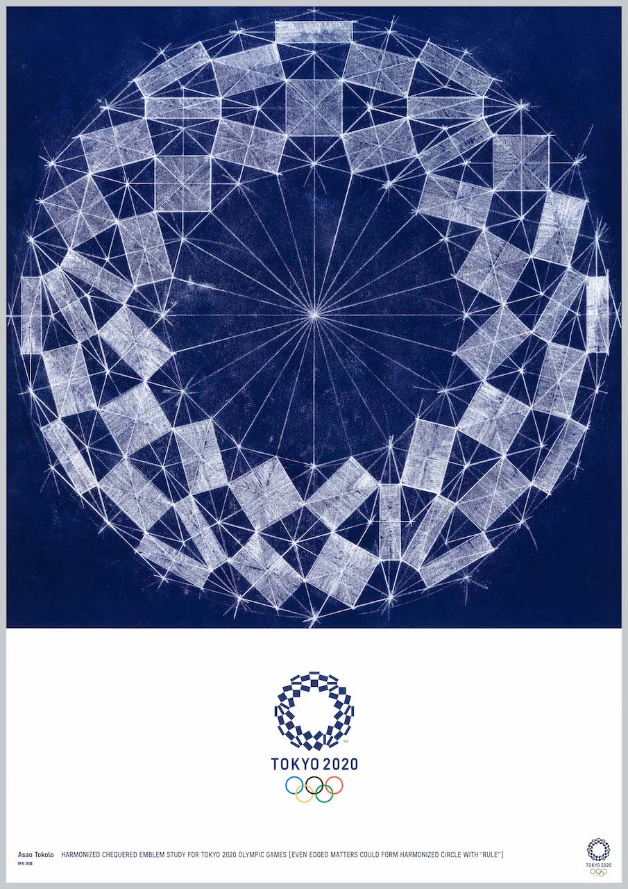
The Tokyo 2020 emblem’s “harmonized chequered pattern” is an indigo circle drawn by combining an equal number of rectangles extracted by connecting the midpoints of rhombuses, for both the Olympics and Paralympics. Indigo has excellent weather resistance in printing and is one of the strong, beautiful colors that remain over time.
A figure in which rectangles as “individuals” form a “group” accompanied by a geometric “rule.” It is realized through a mixture of computer technology and handwork. Paying respect to the compass-and-ruler design carried out in 1964, and imagining what techniques design will be done with in the future, as an artist living in 2020 I made a baton to hand to the next generation and beyond. By making the original drawing by hand, the guide lines and traces up to the pattern’s emergence are visualized, and physicality too is projected onto those lines.
With great respect for the athletes, I wanted to create the Games’ symbol with all my might.
I believe the Olympics is not only for selected athletes. I created this with the feeling that it is a matter for all citizens, from the elderly to adults to children, that it is hope, and that it is something that remains in memory.
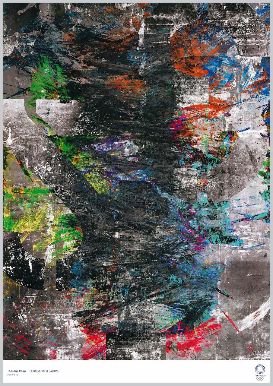
That skateboarding—which originally arose from rebellious street culture—would become an Olympic event was unthinkable until now. Skateboarding has its own language and continues to evolve as a relatively new sport. It is also a composite of art, design, fashion, and music, and has its own methods of expression there.
The work is composed of three layers. First, the layer of Extreme Revelation, inspired by the spirit of rebellion. The traces of skateboard grinds are deformed like brushstrokes, and trial and error is repeated in pursuit of perfection. Next, a lamination of materials evoking the sport of skateboarding, such as concrete and metal, expressing uncertainty, darkness, and oppression. Yet with brilliant colors welling up from within, it also depicts an irrepressible youth and impudence. The third layer is almost invisible, but the enigmatic inversion of numbers and metaphorical graphics asks whether the existing order is something of value.
I wanted to make a work that is playful, richly colorful, and meaningful. While I intend to depict the joy of competition, I also wanted to convey the diversity of cultures and nationalities of the people who take part in the Olympics. The large polka dots of colorful ink image the rings of the Olympic symbol. I abstracted and reconstructed the Olympic icon.
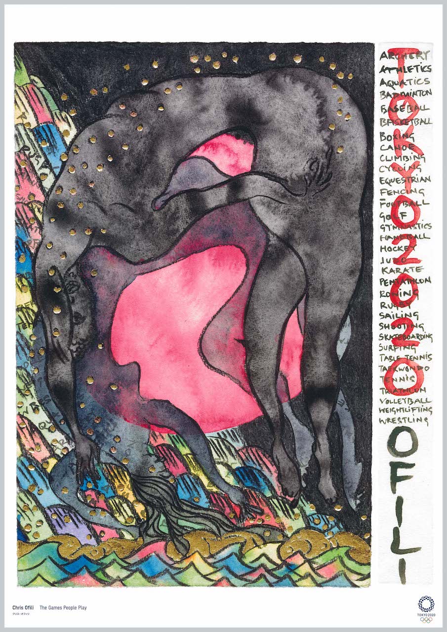
A few months ago, when the organizing committee asked me to create a poster for the Tokyo 2020 Games, at first I thought, “Why was I—who only paints still lifes—chosen?” I had no idea what to do, but of course I couldn’t decline such an honorable request. With the help of my agent Natsuko Kida, I searched the internet for elements related to the Olympics. When I found an image of the New National Stadium, I thought this was material worth trying. After receiving materials and making many sketches, I finally finished a work I was satisfied with and sent it to Japan. A few weeks later, I received a proof from the printer, but looking at it again, I felt somehow unsatisfied. It clearly lacked boldness and essence. The deadline was approaching, but they specially accommodated me and let me start over from scratch. Since the host country was Japan, I decided to draw on washi (Japanese paper), which I regularly use in my work. And, letting my hand go where it would, I drew the figure of the Olympic stadium.
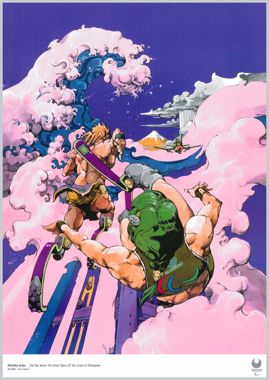
Clouds like raging waves.
I drew them with the image of the gods of sport
descending to Japan from high in the sky.
Using the composition of Katsushika Hokusai’s “The Great Wave off Kanagawa” as a motif,
I agonized over what color to paint Mt. Fuji,
and painted it honey-colored.
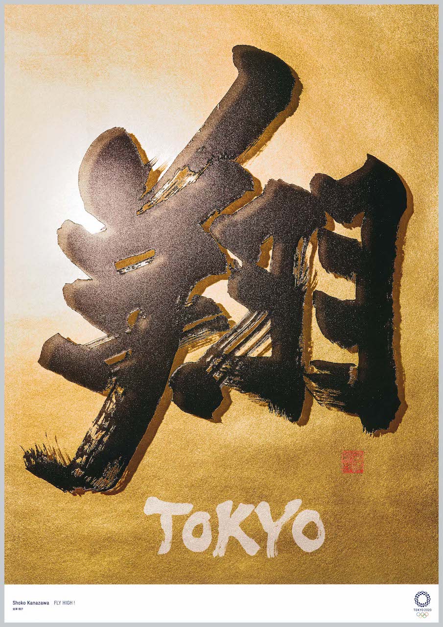
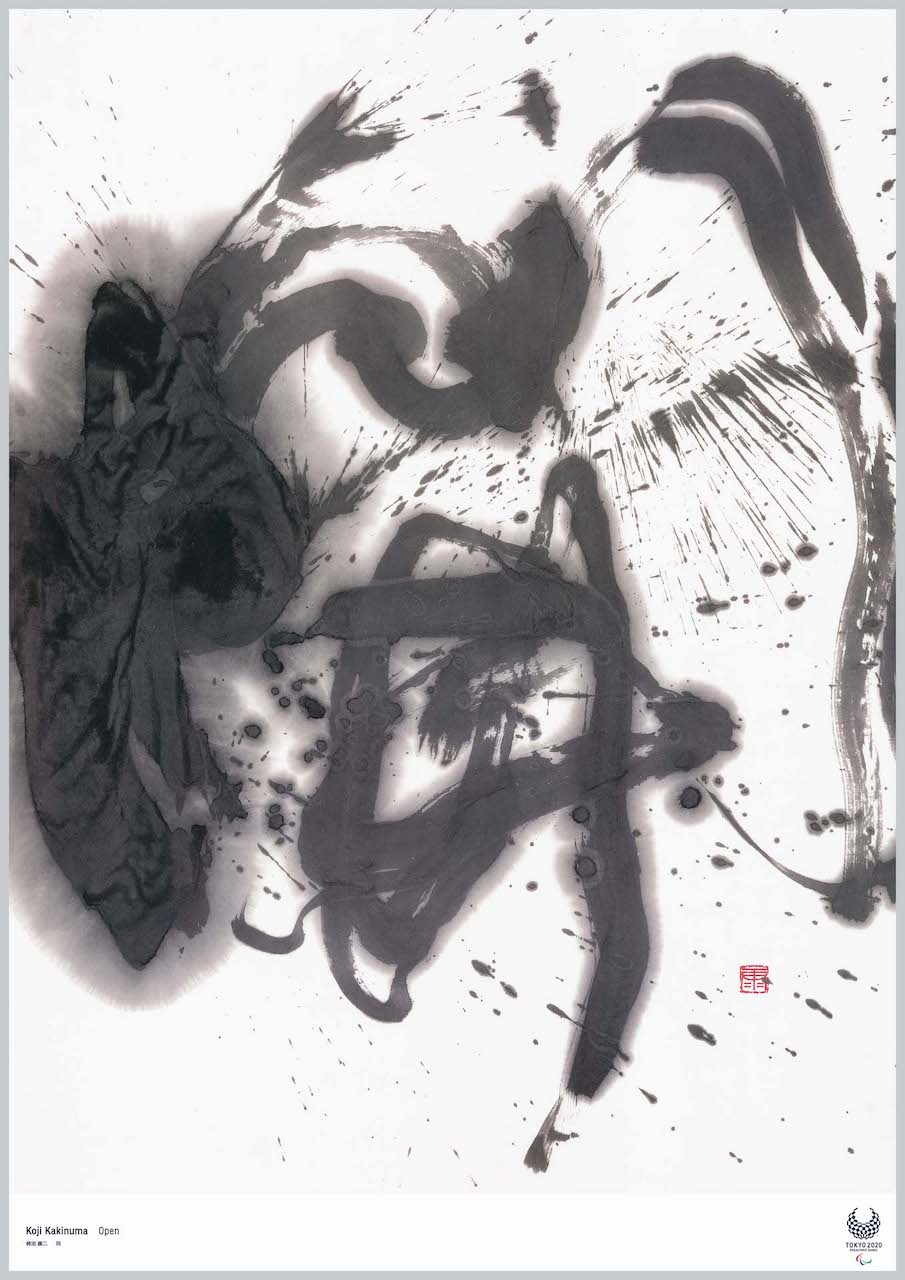
Calligraphy, with a history of over 3,000 years, is one of the great pillars of Japanese culture and art. I have explored the history of that calligraphy and continued my own search and presentation of calligraphy as someone living in the present. For the Tokyo 2020 Olympic and Paralympic art project, after agonizing over what to take as a motif from among tens of thousands of kanji and infinite words, what I arrived at was the single character “開 (open).”
“To open one’s whole being unconditionally toward the universe—that is an explosion.” The words of the artist Taro Okamoto, expressing his challenge and philosophy toward creation, form the foundation of this work. Holding in my heart the souls of athletes who challenge their own summits daily, I struck the brush into the paper, “Open! Open! Open!…”, until I myself was completely opened. I hope that at this century’s celebration held in Japan, not only the athletes and sports people gathering from around the world but each of us who support the Games will open our hearts wide toward possibility, and pass this festival of peace on to the future.
Forward, onward.
Humanity’s prayer to keep pressing single-mindedly forward
leaps beyond the body’s limits, beyond disability, beyond nationality and gender.
In 2020, the lives living in this very moment—
I wanted to symbolically depict all of them as equal and beautiful.
The main motif is “a person moving forward.”
A figure swinging the arms wide and kicking up the ground with all its might.
That primitive sculptural form of movement expresses the will of all Paralympians
striving to move forward toward a more certain future.
All that each athlete has built up.
In respect for all of human history, which has kept advancing through trial and error.
GOO CHOKI PAR (graphic designer)
Forward, onward.
Humanity’s prayer to keep pressing single-mindedly forward
leaps beyond the body’s limits, beyond disability, beyond nationality and gender.
In 2020, the lives living in this very moment—
I wanted to symbolically depict all of them as equal and beautiful.
The main motif is “a person moving forward.”
A figure swinging the arms wide and kicking up the ground with all its might.
That primitive sculptural form of movement expresses the will of all Paralympians
striving to move forward toward a more certain future.
All that each athlete has built up.
In respect for all of human history, which has kept advancing through trial and error.
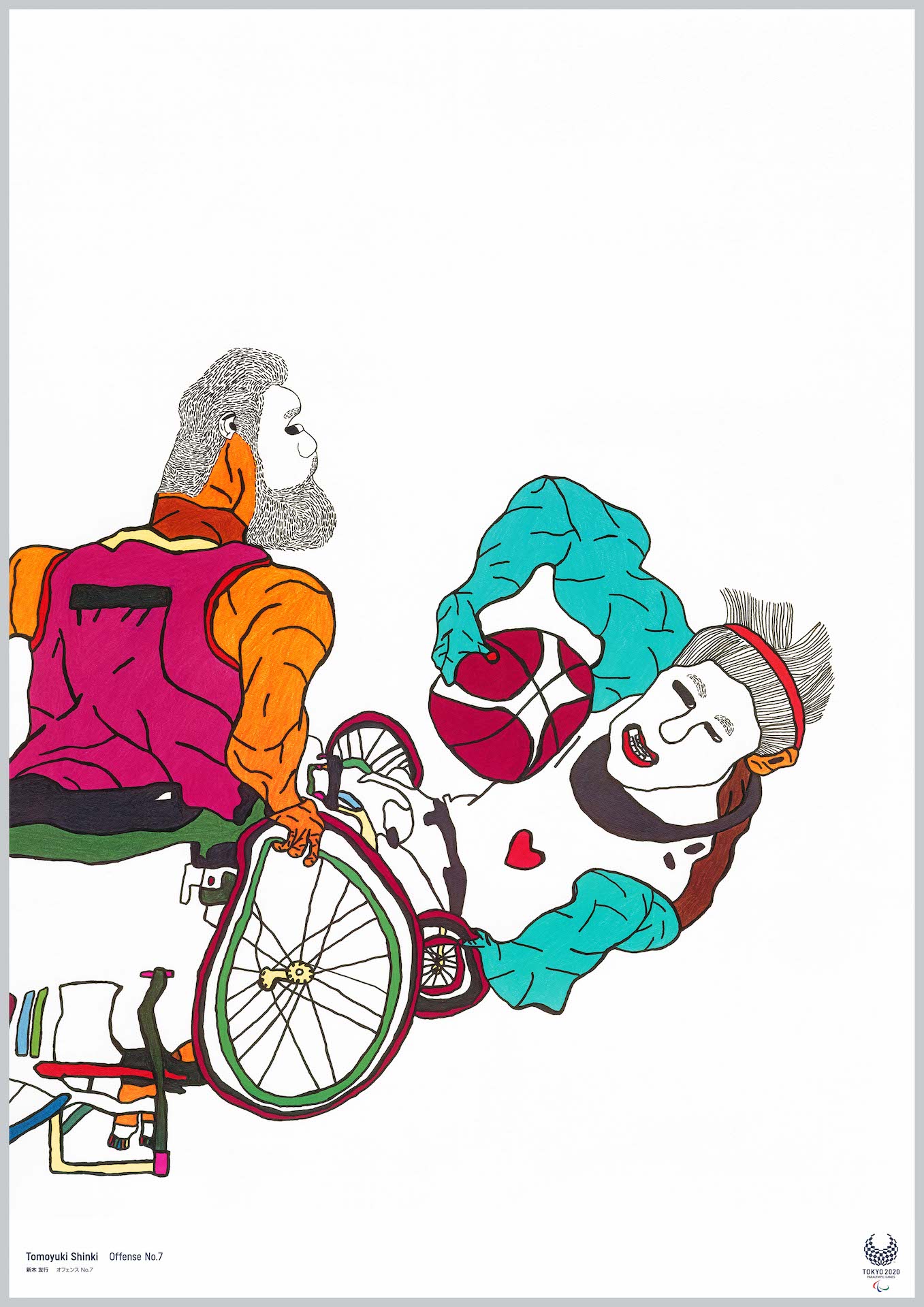
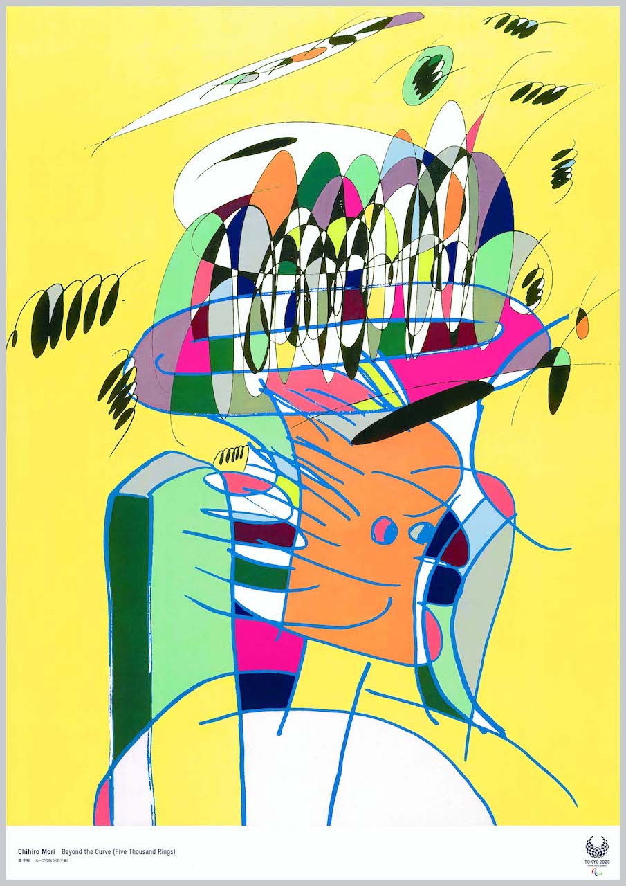
There are all kinds of events—which one should I draw?
I decided to draw wheelchair basketball, which struck my heart when I watched a game live.
The hot, heated games between athletes—the tremendous sense of speed and power.
For color, I used bright colors that lift your spirits.
All the spectators enjoy watching the heated game.
The athletes fight with all their might.
I drew that strength using bright colors.
Looking at the work,
not only people who are full of energy but also those who lack energy right now—
I truly hope they receive even more energy and power,
and feel the wonder of para-sports, the power of the competition,
and the courage of the athletes.
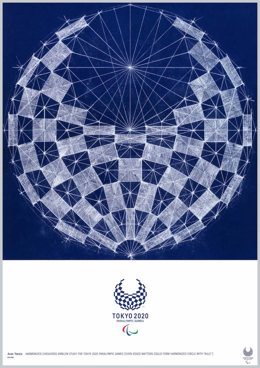
The Tokyo 2020 emblem’s “harmonized chequered pattern” is an indigo circle drawn by combining an equal number of rectangles extracted by connecting the midpoints of rhombuses, for both the Olympics and Paralympics. Indigo has excellent weather resistance in printing and is one of the strong, beautiful colors that remain over time.
A figure in which rectangles as “individuals” form a “group” accompanied by a geometric “rule.” It is realized through a mixture of computer technology and handwork. Paying respect to the compass-and-ruler design carried out in 1964, and imagining what techniques design will be done with in the future, as an artist living in 2020 I made a baton to hand to the next generation and beyond. By making the original drawing by hand, the guide lines and traces up to the pattern’s emergence are visualized, and physicality too is projected onto those lines.
With great respect for the athletes, I wanted to create the Games’ symbol with all my might.
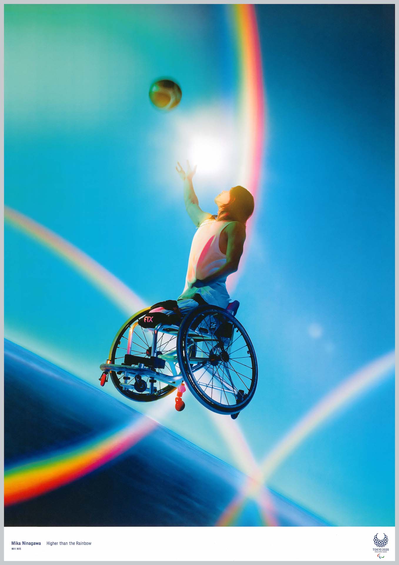
In a space where only the athlete Rensi Chokai, I, and the camera existed,
I simply kept releasing the shutter.
Para-athletes are cool.
A single shot taken with that simple feeling.
Just as a work is born from an empty space,
the beginning that transcends everything lies in a casual place.
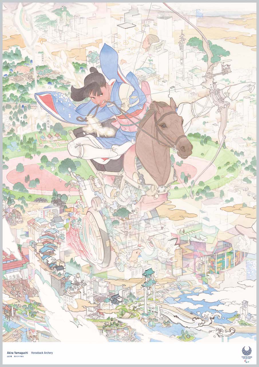
A cityscape of buildings like a bar graph
A junction like internal organs
A town whose feel underfoot is like gums
In the shadow of the birth of a new Ultra-C
I push the cerebellum with a brain spatula
Colorful mire
Warmed bones and building wind
Springs of air
A transparent curve
2020년 1월 6일, 도쿄2020 올림픽의 공식 아트 포스터 공개가 있었습니다.
도쿄2020 대회에서는 올림픽·패럴림픽을 테마로 한 예술 작품을 국내외 아티스트에게 제작 의뢰하여, 도쿄2020 공식 아트 포스터로서 분위기 조성에 활용됩니다.
「도쿄2020 공식 아트 포스터전」 전시 풍경@도쿄도현대미술관
20세기 초부터 각 대회의 조직위원회는 올림픽이라는 스포츠·문화 이벤트에 대한 인지와 이해를 촉진하기 위해 포스터를 제작해 왔습니다. 또한 올림픽 포스터는 각 대회의 특색을 세계에 전하는 역할도 합니다.
근래에는 패럴림픽 포스터를 포함해, 국제적으로 활약하는 아티스트와 디자이너를 기용해 각 대회의 문화적·예술적 레거시가 되는 작품을 제작하게 되었습니다. 그중에서는 시대의 아이콘이 될 만한 작품도 탄생하고 있습니다.
제작된 20작품을 아래에 전부 게재합니다.
올림픽 12작품
우라사와 나오키(만화가)
일본에는 스포츠 만화라는, 세계에서 유례를 보기 힘든 만화 장르가 존재합니다. 이는 일본 만화가 발전·융성해 가는 데 큰 역할을 담당했습니다. 스포츠 관전의 설렘이 일본의 주간 만화라는 게재 페이스에 맞았기 때문입니다. 손에 땀을 쥐는 스포츠의 흥분을 어떻게 만화로 전할 수 있을까, 만화가는 그에 계속 도전해 왔습니다.
「다음 호에 계속!」 독자는 매주 다음 전개를 마치 실제 경기의 향방처럼 지켜봅니다.
이것은 올림픽을 위해 새로 그린 만화입니다. 경기·인종·성별을 초월한 그리기에 도전해 보았습니다. 모든 사람에게 나설 차례가 있습니다. 다음은 당신 차례입니다.
우주 공간을 광속으로 날아다니는 형형색색의 천체 볼 군집…… 반짝이는 극채색과 신들과의 일기일회의 유희…… 지상을 아득히 벗어나 그런 올림픽 광경을 망상하고 있었다.
느닷없이 분홍색 인형이 나타났다.
눈도 깜빡이지 않고 질리지도 않고 담담히 새빨간 구체를 차올리고 있다.
그것은 「놀이의 신」인가?
1964년 도쿄 올림픽 때 다니던 초등학교에서 「종이 오리기(기리에)」를 배웠던 것을 떠올렸다. 머릿속에 떠오르는 망상 우주를 「종이 오리기」로 표현해 보려고 했다.
아틀리에에 흩어진 색종이와 인쇄물, 그리다 만 그림을 대충 오려 공중에 던졌다…… 하늘하늘 색 조각이 떨어진 곳에 「스페이스 키커」가 투박하게 나타났다.
시선, 포물선, 경계선, 복선……. 이 세계에는 다양한 선이 교차하고 있다. 그 무수한 선들은 때로 얽히거나 풀리면서 환경과 심신 속에서 상을 맺어 간다.
본작에서는 그리스에서 계승된 성화를 기점으로 도쿄2020 올림픽 성화 봉송으로 자아내는 동선과, 그 매듭이 되는 800개가 넘는 시구정촌 이름을 그리고 있다.
세계의 일선 운동선수가 모여 경기를 하는 제전과 한 개인을 잇는 선은 대체 무엇일까. 이어지거나 끊기거나, 큰 사상과 개를 잇는 선을 끌어당기는 일은 매우 어렵다. 그런 녹록지 않은 선이 뒤엉킨 다양한 세계에서도, 한 사람 한 사람의 심금을 울리는 예술과 신체가 솟구치는 장이 존재함에 희망을 갖고 임하고 싶다.
운동선수의 혼과 대회를 지탱하는 모든 사람의 마음이 이곳 도쿄에서 하늘 높이 날아올라 세계 사람들에게 닿기를 바라며.
눈부신 빛이 비쳐 드는 서예는 선수의 약동감을 이미지했습니다. 배경에는 일본의 뛰어난 공예 기술인 본금박을 배치했습니다. 서예의 입체감을 표현하기 위해 음영에 이르기까지 세부에 걸쳐 그 전부가 진짜이며, 해방된 에너지와 서예·전통 기술을 하나로 융합해 ‘일본다움’으로 도쿄 올림픽을 표현하고 있습니다.
인간은 한 마리 동물로서 저마다 전부 다른 신체를 지니고, 모두 다른 감각으로 세계를 파악하며, 각자의 환세계(Umwelt)를 통해 세계를 살아간다. 그것들은 하나도 같은 것이 없다. 같은 말도 없다. 같은 빛도 없다. 올림픽이 그 사실에 각오를 다지고 성실히 임한다면, 작은 한 마리에게 세계는 관능으로 가득 차고, 이윽고 새로운 생태계가 움직이기 시작한다.
각기 다른 곳에 있는 다섯 개의 링이 저마다 링 중심에서 나오는 궤적을 따라 이동하면 오륜 마크가 됩니다. 세계에서 모인 운동선수들이 저마다의 개성을 지니면서(다양성) 겨루고(자기 베스트), 그 총체가 최종적으로 오륜이라는 조화로운 모습이 되기를 기대한 ‘미래’를 여기에 표현했습니다. 즉 포스터 자체는 영상처럼 움직이지 않지만, 이를 보았을 때 머릿속에서 일어나는 동적인 이미지를 상상하며 제작하고 있습니다.
전면 손그림 표현을 고집한 것은 올림픽이 신체의 한계에 도전하는 경기이기 때문입니다. 현대는 자칫 뇌로 생각하는 것이 우선되어 신체성을 잊기 쉬운데, 그에 대한 메시지도 거기에 담았습니다.
도쿄2020 엠블럼의 ‘구미이치마쓰몬(組市松紋)’은 올림픽·패럴림픽 모두 마름모의 중점을 이어 추출한 직사각형을 같은 수만큼 조합해 그린 쪽빛 원상입니다. 쪽빛은 인쇄에서 내후성이 뛰어나, 시간이 지나도 남는 강하고 아름다운 색 중 하나입니다.
‘개’로서의 직사각형이 기하의 ‘율’을 동반해 ‘군’을 이루는 도상. 컴퓨터 기술과 수작업의 혼합으로 성립되어 있습니다. 1964년에 이루어진 컴퍼스와 자에 의한 설계에 경의를 표하고, 미래에는 어떤 기법으로 설계가 이루어질지 상상하며, 2020년을 사는 작가로서 다음 세대 이후에 건넬 바통을 만들었습니다. 손으로 원도를 만듦으로써 문양이 나타나기까지의 보조선과 흔적이 시각화되고, 또 그 선에 신체성도 투영됩니다.
운동선수에게 큰 경의를 표하며, 전력으로 대회의 심벌을 만들고 싶었습니다.
본래 반역적인 스트리트 컬처에서 태어난 스케이트보드가 올림픽의 한 경기가 되리라고는 지금껏 생각할 수 없었다. 스케이트보드는 독자적인 언어를 지니며, 비교적 새로운 스포츠로서 계속 진화하고 있다. 또한 아트·디자인·패션·음악의 합성물이며, 거기에는 독자적인 표현 방법도 있다.
작품은 세 층으로 구성했다. 먼저 반역 정신에서 발상을 얻은 Extreme Revelation(위험한 계시)의 층. 스케이트보드 그라인드의 흔적이 필적처럼 변형되고, 완벽함을 좇아 시행착오가 반복된다. 다음으로 콘크리트나 메탈 등 스케이트보드라는 스포츠를 연상시키는 소재의 적층으로 불확실성·어둠·억압을 표현. 다만 안에서 솟아오르는 듯한 극채색으로, 억누를 수 없는 젊음과 당돌함도 그려냈다. 세 번째 층은 거의 보이지 않지만, 숫자와 은유적 그래픽의 수수께끼 같은 반전이 기존 질서란 가치 있는 것인가를 묻고 있다.
놀이 정신이 있고 색채가 풍부하며 의의 깊은 작품을 만들고 싶었습니다. 경기의 기쁨을 그려내는 것을 의도했지만, 그 외에도 올림픽에 참가하는 사람들의 문화와 국적의 다양성을 전하고 싶었습니다. 컬러풀한 잉크의 큰 물방울무늬는 올림픽 심벌의 링을 이미지한 것입니다. 올림픽 아이콘을 추상화하고 재구축해 보았습니다.
몇 달 전, 조직위원회로부터 도쿄2020 대회의 포스터를 제작해 달라는 말을 들었을 때, 처음에는 「왜 정물만 그리는 내가 선택되었을까?」라고 생각했습니다. 어떻게 해야 좋을지 전혀 몰랐지만, 이런 영예로운 의뢰를 거절할 수는 물론 없습니다. 에이전트 기다 나쓰코의 도움을 받아 올림픽에 얽힌 요소를 인터넷에서 찾아보았습니다. 신국립경기장의 이미지를 발견했을 때, 이것은 시도해 볼 가치가 있는 소재라고 생각했습니다. 그리고 자료를 받아 다수의 스케치를 그린 후, 마침내 납득할 수 있는 작품을 완성해 일본에 보냈습니다. 그로부터 몇 주 뒤, 인쇄소 측으로부터 교정쇄를 받았는데, 다시 살펴보니 아무래도 만족스럽지 않다고 느끼고 말았습니다. 그것은 아무래도 대담함이나 본질성이 부족했습니다. 마감 기한이 다가오고 있었지만, 특별히 무리를 들어주셔서 처음부터 다시 할 수 있었습니다. 개최지가 일본이라는 점도 있어, 와시(일본 종이)에 그리기로 했습니다. 와시는 평소에도 작품 제작에 자주 씁니다. 그리고 손이 가는 대로 올림픽 스타디움의 모습을 그렸습니다.
3000년 이상의 역사를 지닌 서예는 일본 문화예술의 큰 기둥 중 하나입니다. 그 서예의 역사를 탐구하며, 현대를 사는 서예의 모색과 발표를 이어 왔습니다. 도쿄2020 올림픽·패럴림픽 아트 프로젝트에 즈음해, 수만 개의 한자, 또 무한한 말 중에서 무엇을 모티프로 삼을지 갈등한 결과 다다른 것이 「開(열림)」이라는 한 글자였습니다.
「온몸과 온 혼이 우주를 향해 무조건 확 열리는 것. 그것이 폭발이다.」 예술가 오카모토 타로의 창조에 대한 도전과 철학을 나타내는 말이 이 작품의 근저를 이룹니다. 자신의 정상에 날마다 도전하는 운동선수의 혼을 가슴에 품고, 「열려라! 열려라! 열려라!……」 하고 자신이 완전히 열릴 때까지 붓을 종이에 두드려 넣었습니다. 일본 개최의 세기의 축제, 세계에서 모인 운동선수와 스포츠 관계자뿐 아니라 대회를 지탱하는 우리 한 사람 한 사람이 가능성을 향해 크게 마음을 열고, 이 평화의 제전을 미래에 계승할 수 있기를 바랍니다.
나아간다, 앞으로.
한결같이 앞으로 나아가려는 인류의 기도는,
육체의 한계를 넘어, 장애를 넘어, 국적·성별을 넘어 약동한다.
2020년, 지금 이 순간을 사는 생명,
그 전부가 평등하고 아름다운 모습을 상징적으로 그리고 싶었다.
메인 모티프는 「앞으로 나아가는 사람」.
크게 팔을 흔들며 힘껏 땅을 차오르는 모습.
원시적인 그 운동의 조형은, 보다 확실한 미래를 향해
앞으로 나아가려는 모든 패럴림피언들의 의지를 나타내는 것이다.
선수 한 사람 한 사람이 쌓아 온 것.
시행착오를 하며 계속 진보해 온 인류의 역사, 그 전부에 경의를 표하며.
GOO CHOKI PAR(그래픽 디자이너)
나아간다, 앞으로.
한결같이 앞으로 나아가려는 인류의 기도는,
육체의 한계를 넘어, 장애를 넘어, 국적·성별을 넘어 약동한다.
2020년, 지금 이 순간을 사는 생명,
그 전부가 평등하고 아름다운 모습을 상징적으로 그리고 싶었다.
메인 모티프는 「앞으로 나아가는 사람」.
크게 팔을 흔들며 힘껏 땅을 차오르는 모습.
원시적인 그 운동의 조형은, 보다 확실한 미래를 향해
앞으로 나아가려는 모든 패럴림피언들의 의지를 나타내는 것이다.
선수 한 사람 한 사람이 쌓아 온 것.
시행착오를 하며 계속 진보해 온 인류의 역사, 그 전부에 경의를 표하며.
여러 경기가 있다 어떤 경기를 그릴까
경기를 직접 관전하고 가슴에 울린 휠체어 농구를
그리기로 정했다
선수들끼리의 뜨겁고 뜨거운 경기 엄청난 속도감과 힘참
색은 기운이 나는 밝은 색을
뜨거운 경기를 관객 모두가 즐겁게 관전하고 있다
선수가 힘껏 싸우고 있다
그 힘참을 밝은 색을 쓰며 그렸다
작품을 봐 주시고
기운찬 사람은 물론, 지금 기운이 없는 사람도
더욱 기운과 파워를 얻어
파라 스포츠의 훌륭함과 경기의 힘,
선수들의 용기를 느끼실 수 있기를
진심으로 바랍니다.
도쿄2020 엠블럼의 ‘구미이치마쓰몬(組市松紋)’은 올림픽·패럴림픽 모두 마름모의 중점을 이어 추출한 직사각형을 같은 수만큼 조합해 그린 쪽빛 원상입니다. 쪽빛은 인쇄에서 내후성이 뛰어나, 시간이 지나도 남는 강하고 아름다운 색 중 하나입니다.
‘개’로서의 직사각형이 기하의 ‘율’을 동반해 ‘군’을 이루는 도상. 컴퓨터 기술과 수작업의 혼합으로 성립되어 있습니다. 1964년에 이루어진 컴퍼스와 자에 의한 설계에 경의를 표하고, 미래에는 어떤 기법으로 설계가 이루어질지 상상하며, 2020년을 사는 작가로서 다음 세대 이후에 건넬 바통을 만들었습니다. 손으로 원도를 만듦으로써 문양이 나타나기까지의 보조선과 흔적이 시각화되고, 또 그 선에 신체성도 투영됩니다.
운동선수에게 큰 경의를 표하며, 전력으로 대회의 심벌을 만들고 싶었습니다.